How Color Choices Can Improve Accessibility on Your Association Website
Designing a website for an association requires more than just visually appealing aesthetics. Accessibility and usability are critical factors that ensure your website serves all members, including those with disabilities. Among the elements that influence accessibility, color choices play a pivotal role. The right color decisions enhance the user experience and ensure your association’s website complies with the Web Content Accessibility Guidelines (WCAG), making it inclusive for all users.
The Importance of Website Accessibility for Associations
In recent years, Diversity, Equity, Inclusion, and Accessibility (DEIA) has become a priority for many associations. Accessibility is a crucial consideration for member-driven organizations, as it ensures all members can interact with your website. For associations, website accessibility isn’t just a best practice; it can protect you from lawsuits.
The Web Content Accessibility Guidelines (WCAG), developed by the World Wide Web Consortium (W3C), are the international standard for ensuring website content is accessible to all users. Most association websites aim to meet WCAG Level AA compliance, which ensures accessibility for users with visual impairments, such as color blindness and low vision. Understanding how people with visual impairments experience your website can help you identify areas for improvement. Try this color blindness simulator to see your content through their eyes.
The Importance of Planning for Accessible Colors
While color contrast guidelines can initially seem restrictive, thoughtful planning enables dynamic, visually compelling designs that are also accessible. When developing or updating your association’s brand color palette, it’s important to include a full range of colors: dark, medium, light, and neutrals. A robust palette ensures flexibility for a variety of applications, such as event visuals, sub-brands, and complex website layouts, without sacrificing accessibility.
Building Color Palette to Support Accessibility
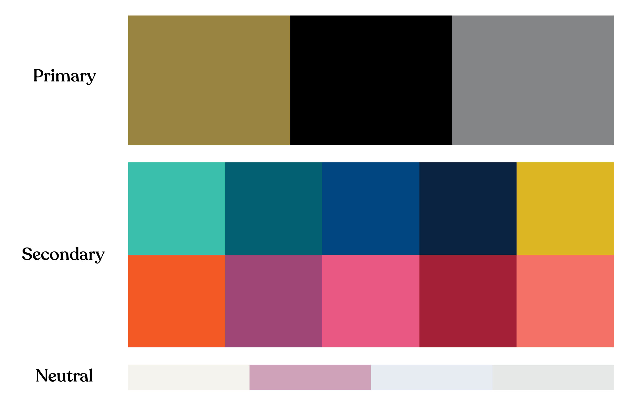
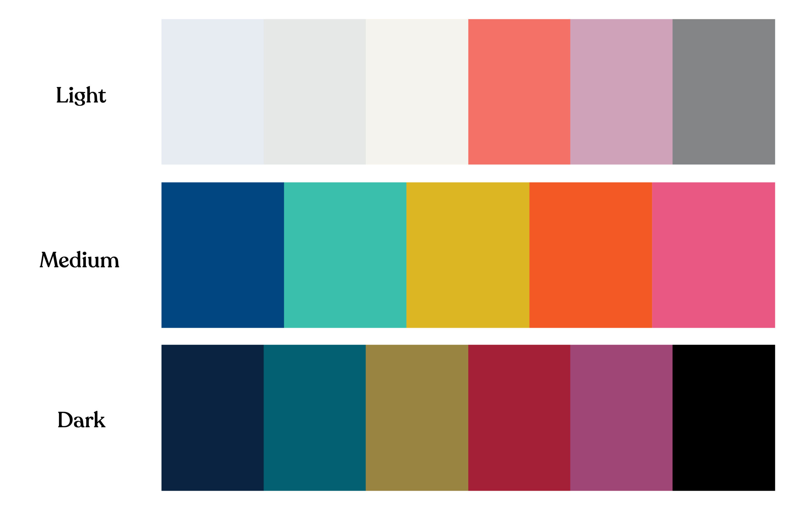

Taking the extra step to test the contrast ratios of your color pairings early in the process ensures that they meet accessibility standards. This approach helps confirm that your colors can be used effectively across different design elements, like text, buttons, and call-out boxes, while maintaining compliance with ADA or WCAG guidelines. With intentional planning, you can achieve designs that are both creative and inclusive.
Understanding the Impact of Color on Accessibility
Color choices on your website significantly affect its accessibility. For example, poor color contrast can make your content difficult to read for users with visual impairments. According to WCAG Level AA standards, text should have a contrast ratio of at least 4.5:1 for normal text and 3:1 for larger text to ensure readability for all users.
Some common areas where color contrast issues often arise include:
- Text over images or videos: Text placed on top of images or video backgrounds can become unreadable if the contrast between the text and the background isn’t sufficient. It’s essential to check that the text remains legible, regardless of the background.
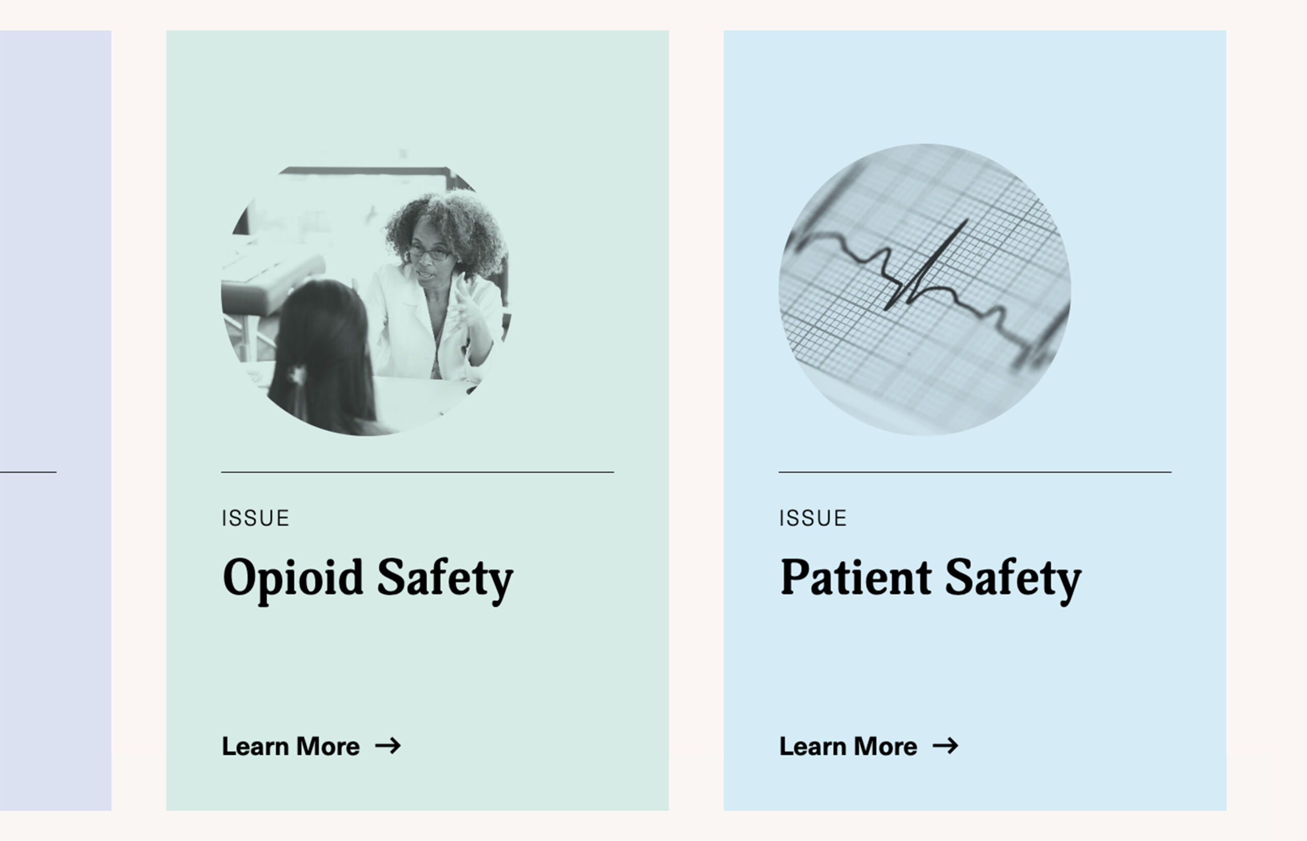
- Call-out boxes: Using mid-tone colors for call-out boxes can lead to poor contrast between the background and the text. Opt for either dark or light backgrounds paired with high-contrast text to ensure readability.
- Buttons and navigation elements: Vibrant colors are often used to make buttons stand out. However, if the contrast between the button’s background color and the text is too low, some users may struggle to read it. Similarly, relying solely on color to identify links can make it difficult for users with color blindness to navigate your website.
Do’s and Don’t’s


Legal Risks of Non-Compliance
Failing to comply with color accessibility guidelines can have legal repercussions. ADA-related website accessibility lawsuits are on the rise, and non-compliance with WCAG standards can expose your association to legal action. Associations are particularly vulnerable due to the public-serving nature of their websites. Ensuring your color choices adhere to WCAG guidelines mitigates legal risks and demonstrates your commitment to inclusivity.
Best Practices for Choosing Accessible Colors
To create an accessible and visually appealing website, associations should follow best practices when it comes to color. Here’s how you can ensure your color choices are both compliant and user-friendly:
1. Test Color Contrast Early and Often
Testing your color contrast during the design phase is crucial. Tools like WebAIM Contrast Checker allows designers to measure contrast ratios and ensure that all color pairings meet WCAG Level AA standards. Testing regularly throughout the design process helps avoid costly revisions later.
2. Design for Mobile Accessibility
With many users accessing association websites via mobile devices, color contrast must be tested across different screen sizes. Website elements can shift or scale on smaller screens, making color contrast appear differently than on desktops. To ensure readability and accessibility, your design team should test how colors display on all devices.
3. Avoid Using Color Alone to Convey Information
WCAG emphasizes that information should not rely solely on color. For instance, if you use color-coded charts or infographics, ensure that there are additional markers, such as patterns or labels, to distinguish between different data points. This ensures that users who cannot perceive color differences can still understand the information being presented.
For example, in a pie chart showing different membership categories, don’t rely solely on colors to differentiate segments. Instead, add patterns, distinct shapes, or labels directly on the chart to make it clear which segment corresponds to which category.
4. Consider Cognitive Disabilities in Your Color Choices
Color choices can affect not only users with visual impairments but also those with cognitive disabilities, such as ADHD or dyslexia. Bright, overwhelming colors can make it difficult for users to focus on content, while inconsistent color patterns can create confusion.
5. Continuously Test and Reevaluate Your Color Choices
Accessibility isn’t a one-time fix—it’s a continuous process. As you update and edit your website, be sure to regularly test new content for color contrast and accessibility. Implementing a regular color audit process ensures ongoing compliance and improves the user experience for all visitors.
Color Choices Empower Accessibility
Color plays a critical role in the accessibility and usability of your association’s website. By making thoughtful color choices and adhering to WCAG guidelines, you can ensure that your website is both visually appealing and inclusive for all members. Prioritizing color accessibility isn’t just about meeting legal requirements—it’s about creating an experience that serves all users, regardless of their abilities.
Tips for Building Better Pages on Your Association Website
Association marketing teams face a unique challenge after launching a new website. Your team is responsible for planning, publishing, or approving any new pages, while protecting its design integrity and the strategy it was built upon. These new pages need to perform at the same high level as the rest of your website.
We have seen many internal marketing teams consistently put significant effort into developing content (program, services, campaign, etc), but fall short in the delivery of that information when it comes time to add it to the website. This disconnect hinders your communications and marketing efforts and contributes to a steady decline in your website’s user experience.
To prevent this, it’s crucial to follow a few key best practices when creating new pages. This will ensure your website continues to support your association’s goals while delivering a seamless experience for your users.
Understand User Intent and Behavior to Inform Page Layout
Aligning any new page with how users will interact with your content is the first step toward creating an effective, user-friendly design. Your association’s website pages should be organized to support one of three key user behaviors:
1. Browsing
When users browse high-level pages, they’re deciding whether to engage further. Website pages such as member benefits, services, event pages, or special initiative landing pages demand easily scannable, bite-sized content.
Users typically will first skim headlines, photos, pull quotes, and graphics before committing to reading body copy or clicking links. You should provide plenty of scannable elements on browsing pages to increase engagement opportunities.
A single column of dense text can look daunting to your users who haven’t committed to digging deeper yet. Breaking information into digestible chunks and/or multi-column layouts allows them to find information faster. Users often browse information in a non-linear fashion, so organize your content accordingly.
2. Researching

Users engage with these pages once they are interested enough to dig deeper into your website to find specific information. Pages such as articles, resources, or event details target a motivated audience, and the layout should enhance their experience.
Clear, compelling headlines and subheadings remain important to guide users to information. You should also enhance the page’s content with photos, videos, and other graphics to explain concepts that words alone may not be able to convey.
3. Action
When users reach a page intended to drive a specific action, your layout needs to get out of their way. Action-oriented pages like newsletter sign-ups, member registration, or event registration forms should feature a direct, less-is-more approach. You’ve already sold your users on what you have to offer, so keep the page focused on the desired action.
Key Design Principles for Building Effective Pages
Once you understand your user’s goals, you can build a page that will deliver an effective user experience. Depending on your website, your CMS may have tools in place to enhance how your page looks and functions.
For example, WordPress includes Gutenberg blocks that your team can use to create page layouts. When you work with Position, we go a step further and build a custom set of common layout elements so new pages seamlessly integrate with the rest of your website.
Most new pages begin with a cut-and-paste from a text document. But you can’t stop there. The first step to creating visual interest is using headlines and subheads to create a visual hierarchy. Then, incorporate one or more images to add aesthetic value while also enhancing and reinforcing your content. The types of images you choose reinforce your content while also enabling members to see themselves in your brand.
For many pages, a clear headline structure and the right image or two are enough to be effective. For more complex pages, especially those designed for browsing, consider using columns, image galleries, and videos to organize your content in a digestible, logical way.
To elevate your page layouts and create a more intuitive and engaging user experience, consider these fundamental design principles:
Hierarchy
A clear visual hierarchy guides users through what’s most important on a page. Think about what you want your users to see first, second, and third and so on. What are they looking for? If they only notice one element on the page, what should it be?
A visual hierarchy is often communicated through scale. People naturally look at bigger images and headlines first. But you can also express importance by placing information higher or lower on the page or using design principles like color, contrast, and whitespace to underscore key details.
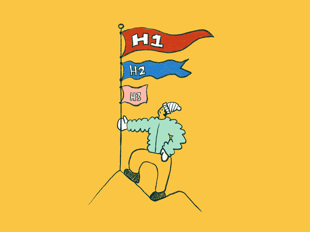
Semantic headings (H1s, H2s, H3s) help users understand where they should look first. Remember, not everything on a page can be important at once. Establishing a hierarchy makes it easier for users to find the information they need.
Rhythm & Flow

Users become fatigued seeing the same layout on every page. Keep readers engaged and avoid monotony by balancing text-heavy sections with scannable content. Color, photos, illustrations, and graphic elements are just a few ways to maintain user interest and guide their eye along a page.
However, you have to be careful, as incorporating too many elements will make your design chaotic and hard to follow. Strike a balance between consistency and variety in a way that strategically allows certain details to stand out and create a pleasing user experience.
Maintaining Accessibility Is Crucial for Associations
As you add new content to your association’s website, be vigilant about ensuring it remains accessible to users. Accessibility not only keeps your organization in compliance with the law but also boosts your site’s SEO.
Maintaining your website’s accessibility is a topic that could fill an entirely separate article. However, here are a few guidelines to keep in mind:
Image and Video Accessibility
Always add alt tags to non-decorative images and captions to videos, ensuring that users with screen readers will understand the visuals on your pages.
Proper Heading Structure
Using appropriate heading tags for headings (H1, H2, H3, etc.) enables users to understand how information is structured. Screen readers rely on these tags to interpret the page’s layout, so ensure each section is introduced with an appropriate heading.
Unique Page Titles
Every page on your website should have a unique, descriptive title. This practice not only helps with SEO but also allows users to understand the content of each page.
Correct Use of Lists
When formatting lists, use numbered or bulleted styles appropriately. This helps screen readers convey whether the items are in a specific sequence or not, making it easier for all users to navigate and understand your content.

Empower Your Team to Create Polished, Effective Pages
After you and your team launch a redesigned website, you have to protect your association’s investment. Keeping your website updated with fresh content is key, but so is ensuring every page serves your members, your association, and your brand.
The impact of one poorly designed page may seem minimal. However, over time, the cumulative effect can compromise your website’s effectiveness and diminish trust among current and potential members.
If you adhere to these best practices, you can confidently create and publish new pages that maintain design consistency while elevating your website’s impact.
Separating Good from Great: 3 Examples of Standout Association Websites
Your association website acts as both the first impression of your organization as well as its primary point of contact for current and prospective members. In terms of enabling your organization to achieve its goals, redesigning your website is a high-stakes undertaking.
As you plan for your new website, you may struggle to articulate exactly what elements transform an association website from merely good to truly great. To provide some inspiration, we’ve surveyed the field of member-focused organizations in search of examples of impressive website design. Though each of the websites we’ve chosen has a distinctive focus, all three share a similar trait: Each one is built from strategic decisions that enhance their message and enable them to form a stronger connection with their members. But first: What makes these websites so successful?
Keys to a Cohesive Association Website
A truly effective website doesn’t just tell your story – it communicates who you are and who you serve. By bringing the following elements into alignment, you create a cohesive user experience that resonates with your audience and reinforces your brand identity.

Content: Confirming Your Brand Identity
Your website’s content should provide proof of your value. From the hero image on your homepage to your resources section, every component should work together to communicate who you are and what you stand for.
Navigation: Expressing Organizational Priorities
The elements of a website’s navigation function as a reflection of what matters most to your association. The terms chosen and how they are organized communicate your priorities to your members and search engines.
Design: Delivering Your Association’s Message
Cohesive design strengthens your messaging by creating a seamless user experience. Every design choice should support your brand identity and engage your audience. A well-designed site organizes information effectively, instilling confidence in users that they’re in the right place.
3 Examples of Successful Association Websites
An effective website does much more than inform your users. It’s a powerful tool for member retention and recruitment that communicates your organization’s story and delivers on the value of membership.
We should note one important caveat. Evaluating a website’s effectiveness requires an understanding of how well it’s designed, built, and maintained to meet specific goals, serve particular audiences, and address unique needs.
Since we didn’t design or create the websites reviewed here, we don’t have insight into the objectives or strategies behind them. However, by drawing on our design expertise and analyzing the visible content, we’ve highlighted these standouts to offer valuable inspiration. Additionally, we’ve suggested areas for improvement, recognizing that every website has room to grow.
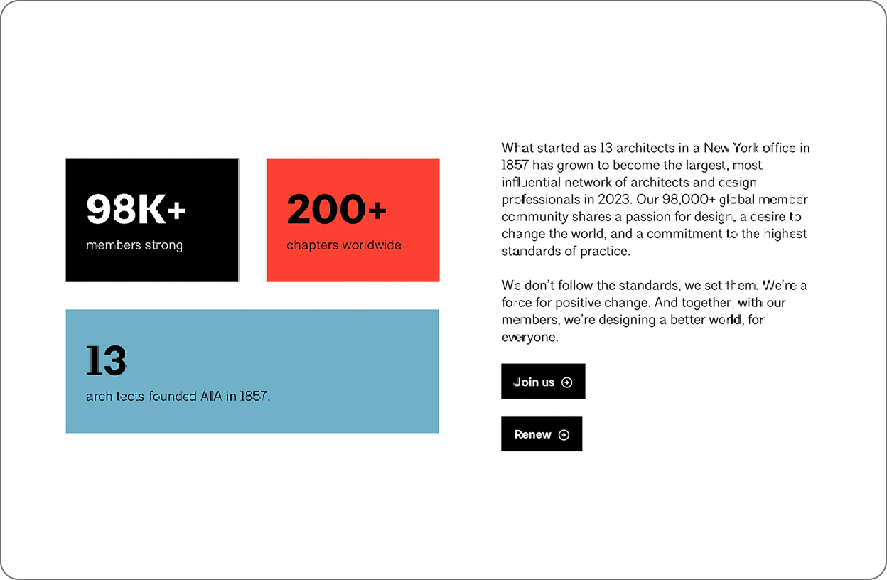
1. American Institute of Architects (AIA)
AIA offers a sleek, hardworking website that feels effortless. With its minimalist design and clean grids, it speaks directly to architects. The layout balances compelling marketing and valuable content, all working seamlessly together. Every element is thoughtfully crafted to showcase the value of membership, engage members with useful resources, and effectively represent the industry and organization. AIA doesn’t just tell you who they are—their website shows you.

Confirming Brand Identity Through Content
Potential members need to understand who you are and what you offer in the first few moments on your website. Below the hero video, a bold statement succinctly explains the organization’s identity. This aspirational expression of a shared belief frames who should be a member and sets a tone of belonging. Just below, we get a few proof points in the form of the latest news and featured projects. These elements provide clear examples of how AIA is translating their words into action and real-world results.

Back Up Your Claims With Proof
The headline “Build knowledge with exclusive resources” proposes a value proposition, and then six resources serve as proof points to those considering membership.

Navigation That Communicates Priorities
AIA’s collapsed navigation menu speaks volumes about what’s most important to the organization. Short, punchy terms pack messaging into a small space, giving visitors a clear sense of what AIA is about without reading a single word of body copy.
One note for improvement: The navigation terms in the collapsed menu are effective, but the overall navigation at the top of the website has too many items competing for attention. The user isn’t sure where to go first.
Leveraging Design for the Right First Impression
In a world full of distractions and short attention spans, your website design plays a crucial role in capturing attention and keeping users engaged. AIA’s homepage is well-organized, with a clean, minimal design that uses whitespace effectively to highlight key elements. The content transitions smoothly between various formats and sizes, creating a rhythm that keeps users interested.

Build Trust Through Consistency
The website’s interior pages smartly use a modular design system to create unique pages. Designing with a core set of components ensures a consistent experience that is more efficient for users to navigate. Just as importantly, it adds to the perception of professionalism and trust in the organization.

Align Your Imagery to Your Values and Goals
AIA also uses high-quality imagery throughout the website to show the association’s diverse range of members and portray them in a professional way. Each photo serves to humanize the organization and elevate the members and their industry.
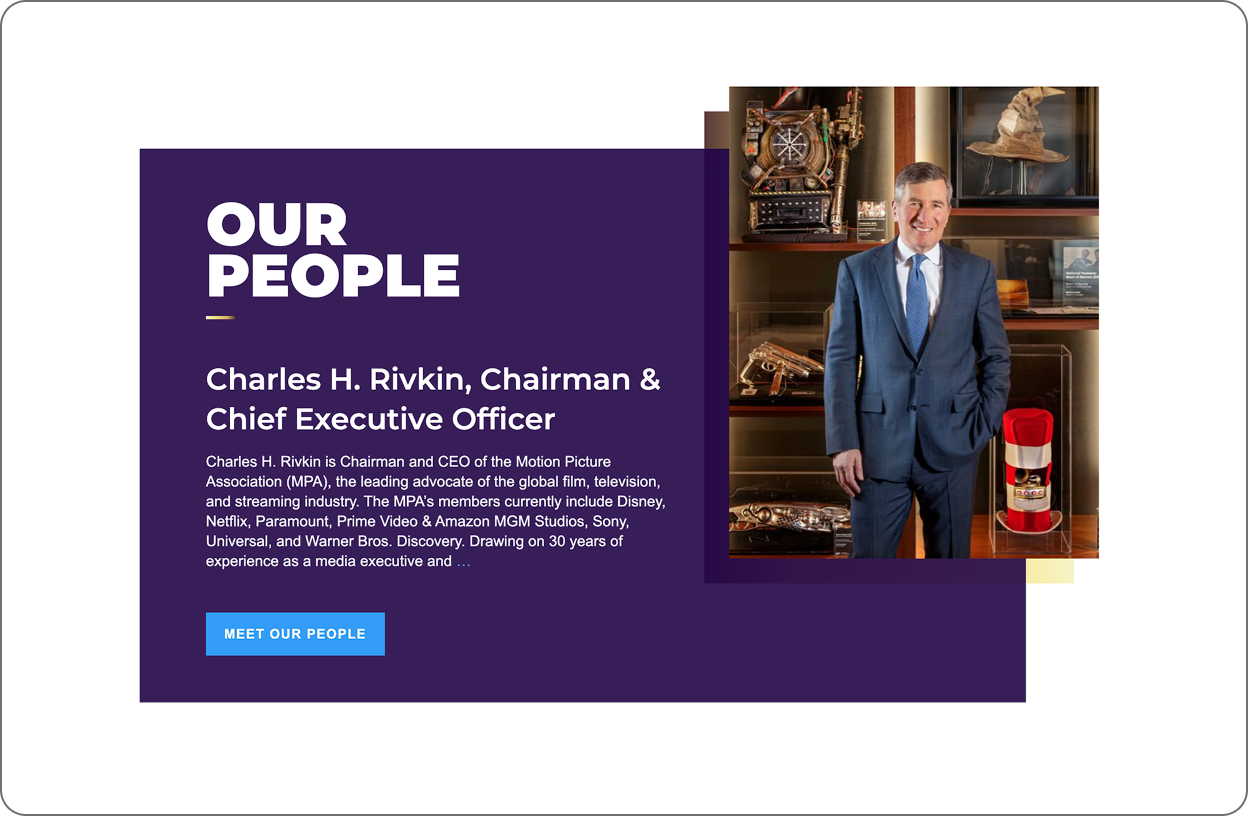
2. Motion Pictures Association
The Motion Picture Association’s website effectively captures the essence of the film, television, and streaming industry around the world while clearly communicating its mission. Strong visuals, focused content, and a clean design engage members and reflect the organization’s professionalism. This simple website delivers an immersive and streamlined experience.

On-Brand Content Strategy
When users visit the Motion Picture Association’s website, they’re instantly immersed in the world of cinema. The site seamlessly blends organizational messaging with timely, relevant content to create a captivating experience. High-quality video from iconic Hollywood films, paired with concise, impactful copy, reflects the organization’s identity while clearly communicating its mission.

Focused Content Delivers a Digestible Message
With only five major sections on the homepage, the Motion Pictures Association achieves a delicate balance. The site is visually captivating without becoming overwhelming, allowing visitors to quickly grasp the association’s purpose and values.

Leveraging Design Best Practices to Compete for Attention
Dynamic layouts marked by rich imagery keep users engaged as they explore the content. The consistent use of white space and a limited color palette provides added energy and focus, guiding visitors’ attention to key information.
Professionalism Through Consistency
A cohesive design approach (typography treatments, color palette and layout compositions) creates a reliable and trustworthy experience for users, reinforcing the association’s professional image as they navigate to different sections.

Suggestions for Improvement
However, MPA’s website still needs improvement. Reorganizing the main navigation down to four to six navigation terms will be less overwhelming to the user and will clearly communicate the organization’s priorities.
3. Entomological Society of America (ESA)
The Entomological Society of America’s website is dynamic and engaging. It showcases entomology through vibrant visuals while providing essential professional resources. The site effectively functions as both a member recruitment tool and an educational resource, reflecting the organization’s commitment to serving the professional and scientific needs of entomologists.

Standout Images and Balanced Messaging
With bold, contrasting colors and standout imagery, ESA declares that this isn’t your grandfather’s bug club. By prominently featuring what its members are passionate about, ESA transforms a niche subject into a powerful design asset.
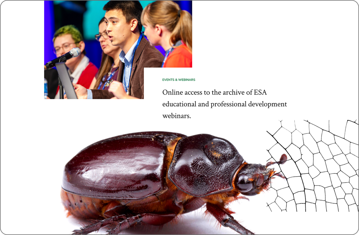
Maximizing the Impact of Photos
Oversized insect imagery immediately draws the eye, along with professional photos of members in action. The pages artfully blend the association’s focus with the human element of membership. Plus, the design shows a good understanding of how people use websites, scanning and then engaging if they find something interesting.

Depth of Design Elements Maintains Engagement
Consistent use of three image types — close-up nature textures, dramatic bug close-ups, and high-quality member photos — is on message and gives the marketing team a wide variety of assets to work with.

Belonging Through Imagery
Crucially, ESA avoids the pitfall of relying solely on insect imagery. The inclusion of diverse, high-quality photos of members strikes a smart balance, reminding visitors that while bugs are the passion, people are the heart of this organization. This approach not only engages current members but also helps new members envision themselves as part of the ESA community.
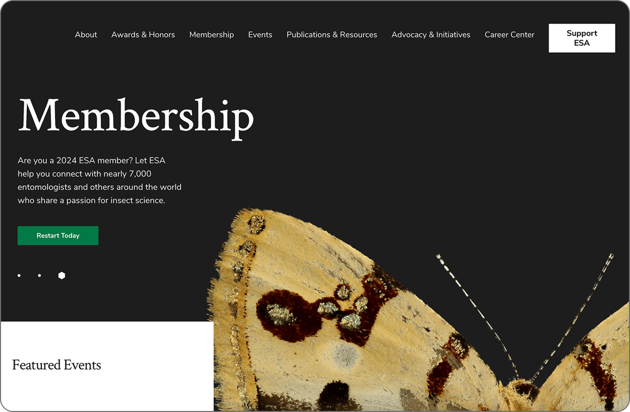
Strategic Design Choices
Large, impactful images paired with concise copy blocks in generous font sizes cater to modern web browsing habits, allowing users to scan and engage with content quickly. Dynamic imagery punctuates key calls to action, guiding visitors toward important information and interactions.

Navigation Leaves Room for Improvement
The ESA website excels at communicating its focus and connecting with members, but its navigation structure still needs attention. The terms are standard for associations, but they could be more effective at communicating ESA’s unique identity and priorities. A more streamlined, distinctive navigation could further enhance the website experience.
Crafting a Website That Elevates Your Association
A great website isn’t just a digital brochure. It’s a powerful communication tool for expressing your value and delivering member benefits.
Creating a website that truly resonates with your members and expresses your association’s story goes beyond aesthetics. It’s about strategically aligning your content, navigation, and design to deliver a cohesive message that speaks directly to your audience.
By understanding which strategies work well (and a few that don’t), you’ll be better prepared for your next website project, one that serves your current members while attracting and inspiring the next generation. If this kind of website redesign will benefit your association, we’d love to help you get started.
User Interface is Key to Stronger Association Websites
Your association’s website is the digital face of your organization. It’s often the first point of contact for prospective members, and it sets the tone for every subsequent interaction.
Your website’s user interface (UI) — its visual appearance, interactivity, and overall feel — plays a crucial role in shaping that first impression. How your website looks, what it says, and how it’s organized all express details about your association to its audience. Even the images on your website underscore your identity and help potential new members see themselves in your association.
These visual elements aren’t the product of aesthetic preferences. They’re strategic design decisions that impact your association’s ability to communicate with its audience. A thoughtfully designed UI elevates your brand, enhances your messaging, and creates a stronger connection with your audience.
The Power of a Comprehensive Brand System
Before you determine the visuals that make up the core of an engaging and intuitive UI, you need to develop the right tools. A well-developed brand system forms the bedrock of an effective user interface design.
A brand system provides more than a recipe for your association’s logo, color, and text specifications. It’s a comprehensive framework encompassing your brand’s visual and verbal identity and how you express those details to your audiences. A brand system includes the specifics of your association’s voice and tone, messaging, values, and more.
When applied to your website’s user interface, the elements of your brand system create a toolbox to express the character of your organization. Fonts, patterns, and color palettes set the tone for your website’s content. The right design elements communicate your organization’s personality, for example, that your organization is warm and people-driven, or perhaps that it’s more clinical and academic.
A brand system ensures your website’s user interface does more than look appealing and function in an intuitive way. It also expresses who you are as an organization.
Key Elements of a Strong User Interface
Your audience of current and future members will perceive a lot of information from how your website’s user interface functions. An appealing UI draws your members toward what they need and builds affinity with your association and its website.
The visual aesthetic of your website’s UI expresses the character of your organization. Each of the following elements plays a vital role in creating an engaging and intuitive experience.
Visual Hierarchy: Guiding the User Journey

A well-organized design enables your members to explore your website to find the information they need. However, a strong visual hierarchy clearly indicates the most important information on every page to create an intuitive user experience.
Strategic use of scale, contrast, white space, and color create visual order to your website. This visual hierarchy reduces cognitive load for your users while enabling them to find information quickly and easily.
Design Consistency: Building Trust and Credibility
With a brand system, your association gains a valuable framework for expressing its story through design. A consistent execution of visual details across your website communicates trust and reliability to your users.
This should extend to resources like job boards or event calendars, which may incorporate external functionality. Maintaining a consistent, cohesive UI throughout your site enhances your organization’s credibility.
Rhythm and Flow: Enhancing User Engagement

A well-designed layout creates a flow that promotes the right behavior, whether guiding users to complete a specific objective or encouraging further browsing. For example, a page guiding users to submit a form should minimize the steps needed to complete the action and eliminate distractions. Pages meant for browsing and education should create a clear layout of information for users and lead them to the next action you would like them to take.
Users also grow fatigued seeing monotonous layouts while navigating longer pages. Balancing text-heavy sections with scannable content keeps users engaged, while varied design elements on the page maintain interest and guide the eye.
Photo and Video: Bringing Your Story to Life

Professional photos and videos are powerful tools for building engagement and enhancing your website’s narrative. Plus, they enable prospective members to see themselves in your organization based on who appears on screen.
Member-driven associations are often tempted to use candid photos and videos taken by staff to create an authentic reflection of their identity. This inclusion of members in your website’s visuals is an effective way to connect with current and prospective members. However, professional-quality photos and videos will better reflect your organization’s professionalism and respect your members by portraying them in the best light possible.
Download Ebook
Elevating Your Association’s Communication Through Thoughtful UI Design
A well-crafted user interface is essential to creating a successful, member-first website. When designed thoughtfully, the visuals making up your UI are a powerful tool that enhances your association’s messaging while forming a stronger bond with the next generation of members. By working with a partner who understands the specific needs of associations and has years of elevated design experience, you’ll create a user experience that seamlessly serves members and your organization. If this sounds like the kind of approach that will help your organization extend its digital reach, we should talk.
Design for All Users: 3 Keys to Accessibility for Your Association’s Website
Your website is your association’s most powerful communication tool. Delivering a vital and engaging resource to current and prospective members is your top priority in a digital-first landscape. But you also have to ensure your website will connect with all of your visitors.
Diversity, Equity, Inclusion, and Accessibility (DEIA) initiatives aren’t just trending topics. They’re core priorities that enable your website to connect with audiences of all abilities. Whether you’re considering a new website for your association or a refresh of its current look, accessibility must be a key consideration in how it’s designed, built, and maintained.
If you aren’t factoring accessibility into your website priorities, you’re limiting the audience for your association’s message. Worse yet, you could be at risk of costly legal action if it falls short of compliance with current regulations. But more than avoiding potential consequences, having an accessible website is simply the right thing to do.
Why Accessibility Matters In Association Website Design
A website designed to accommodate accessibility simply ensures that users with disabilities have access to the same information as everyone else. In the same way, a building with stairs at its entrance prevents those with differing physical capabilities from entering, a poorly designed website restricts access for people with limited vision, hearing, or other impairments.
For example, screen readers allow users who are visually impaired to navigate a website, interact with it, and consume the information. Design, coding, and management best practices allow accessibility tools to work with a well-built website. If your agency partner doesn’t view accessibility as a core priority in their website designs, your association will turn away users reliant on these tools.
Plus, an inaccessible website violates the ADA/Americans with Disabilities Act. Dating back to 1996, the government has ruled websites are subject to the same requirements as physical locations. If your website falls out of compliance with ADA standards, you’re a target for legal action that can lead to fines and a costly effort to update your website to accommodate all users.
3 Core Considerations in Evaluating Website Accessibility
Applying empathy toward the user is a fundamental trait of good website design. While the full breadth of digital accessibility standards may seem overwhelming to consider, the right website design agency will focus on key areas of accessibility to ensure your association is compliant. Here are three top areas to consider:

1. Design Principles and Best Practices
Website users who are visually impaired depend on screen readers to find what they need. To accommodate screen readers, the information on every page should be arranged in a clear hierarchy. Using things like heading tags, ordered and unordered lists, and tables appropriately enables these tools to help the users intuitively navigate the website and find what they’re looking for.
Along with accommodating the visually impaired, website designs should take into account users with limited vision or other visual sensitivities. The right agency partner will factor in the following design elements as they create a website for your association:
- Color: Ensure sufficient contrast between text and background colors to improve readability for all audiences. The color of each element should also not be the sole consideration for delivering information. Your designers should incorporate additional visual cues as well as text to accommodate users with visual impairments.
- Motion Graphics and Video: Some users find animations, flashing graphics, and other content with motion effects disorienting. If your videos are set to play automatically, users should have control over pausing or stopping them.
2. Development Standards
You and your marketing team won’t be writing the code for a new website design—that’s why you have an agency partner. However, the technical elements of your website’s design are crucial to enabling accessibility features and maintaining ADA compliance.
You should ensure your design incorporates accessibility best practices. This checklist provides an easy-to-digest rundown of coding and content standards that will protect website compliance. One easy way to check surface-level accessibility is to verify that you can navigate the website using a keyboard alone. But don’t stop there; make sure you find a partner with experience meeting WCAG2 compliance requirements.

3. Website Maintenance Principles and Best Practices
Choosing a design agency that prioritizes accessibility is the first step to securing a website that complies with current standards. However, accessibility is not a one-and-done responsibility. It’s an ongoing area of focus for you and your team.
As you update your website with landing pages and other content, you have to be vigilant about ensuring your website remains accessible. A few guidelines for content creation include:
- Adding alt tags to images and captions to videos that are not simply for decoration ensures they are understood by people using screen readers.
- Use headings (H1, H2, H3, etc.) to help the user understand how the page’s content is organized and the order in which to consume it. Heading tags should introduce all content.
- Providing a unique title for each page.
- Ensuring each button and its label element are unique and descriptive. This is especially important when your page includes multiple links with the same text (such as “read more” or “learn more”)
- Using appropriate tags (ordered list, i.e., numbers or unordered lists, i.e., bullets) for listed content to ensure a screen reader will accurately identify whether items in a series are ordered or unordered.
Your Association Can’t Afford to Ignore Accessibility
By law, every organization providing information to the public must deliver an accessible experience for every user. Whether you are new to accessibility or have been thinking about it for a while, it needs to be part of your next website project budget and scope.
Designing, developing, and testing an accessible website does take more time and effort. But in the end, it’s not a dramatic increase in either, and it is far easier to design an accessible website from the beginning than to remediate it to comply with ADA standards later on.
If this sounds like an approach that will benefit how your association reaches its audience, we should talk.