Themed vs. Evergreen Event Branding: Which Approach Fits Your Association?
Events are a critical touchpoint for associations, serving as a revenue stream and a platform for meaningful engagement. A well-executed event brand and theme can transform an annual gathering from just another date on the calendar into a must-attend experience. It establishes an emotional connection with attendees, communicates the organization’s values, and sets the stage for long-term engagement.
Associations often face the challenge of balancing tradition with innovation. How do you keep an event fresh each year without losing its identity? Effective branding provides the answer, ensuring consistency while offering room for creativity and evolution. A strong event brand not only drives attendance and sponsorship but also reinforces the organization’s identity, helping to foster deeper member connections and long-term loyalty.
Before exploring the two primary branding approaches, it’s important to understand what we mean by a ‘theme’ in event branding. A strategic theme is not just decorative but should connect to your organization’s identity, values, and audience interests. With that in mind, let’s explore the key strategies for branding your events.
Themed Event Branding
In themed event branding, the event’s visual identity changes entirely each year based on a new theme. Think of it as giving your event a fresh coat of paint annually, designed to excite and re-engage your audience. While this strategy generates renewed buzz and attracts returning attendees, it can also create challenges in maintaining long-term brand consistency and audience retention. Organizations must balance the excitement of a fresh theme with the need to reinforce an event’s value and identity over time.
Pros:
- Keeps things fresh
A new look each year creates excitement and signals something new to attendees. - Encourages attendance
A distinct theme can highlight what’s different and unique about this year’s event. - Offers creative flexibility
A new theme allows dynamic marketing campaigns to align with current trends and audience interests.
Cons:
- Higher costs and effort
Creating a brand from scratch each year demands more time and resources. - Potential misalignment
The theme can impact attendance and engagement if it doesn’t resonate with attendees.
Best For:
- Long-standing events with an established audience that already understands the event’s core value.
- Organizations looking to keep a fresh, dynamic appeal to returning attendees.
Evergreen Event Branding with Annual Themes
An evergreen event brand with an annual theme approach establishes consistency that builds year after year while integrating annual themes to keep things relevant. It should align with the association’s mission statement and long-term strategic goals by reinforcing key values, fostering brand recognition, and ensuring continuity in messaging. Maintaining a steady identity while adapting to industry trends helps associations build stronger relationships with their members in the long run.
Pros:
- Builds brand equity
A consistent event identity strengthens recognition and trust over time. - More efficient marketing
Evergreen elements can be reused, reducing design and production costs. - Supports long-term storytelling
Allows for themes that align with organizational values. - Facilitates early marketing
Core branding elements enable save-the-dates and sponsorship outreach before finalizing the year’s theme.
Cons:
- Requires upfront investment
Establishing a strong evergreen brand takes strategic planning and initial design resources. - Risk of stagnation
If the evergreen branding isn’t periodically refreshed, it can feel stale. Small updates to the design system can help keep things exciting. - Negative Brand Perception Carryover
If one year’s event underperforms, the association with past experiences can hurt future attendance. Address attendee concerns directly and make visible improvements.
Best For:
- Organizations building or re-establishing the reputation of their event.
- Events that benefit from strong brand continuity and long-term audience trust.
Choosing the Right Approach
If your event has an established audience and thrives on fresh, dynamic appeal, an annually themed approach can keep things exciting while reinforcing its core value. For organizations building or re-establishing an event’s reputation, an evergreen brand offers long-term consistency while allowing room for creative variation.
Evaluating the best event branding strategy requires a deep understanding of your audience, organizational objectives, and long-term vision. Start by assessing how your current event branding is perceived—does it generate excitement and recognition, or does it need a refresh? Conducting surveys, reviewing attendance trends, and analyzing sponsorship retention rates can provide valuable insights.
Regardless of the approach, well-executed event branding fuels marketing, drives attendance, and enhances sponsorship opportunities. If you’re unsure about the best strategy for your event, a thoughtful discovery process—and expert guidance—can help you make the right decision.
Why Your Association Needs a Fractional Creative Director
Running an association is a balancing act—managing member needs, promoting events, and juggling day-to-day operations while ensuring your brand remains compelling and consistent. For many associations, creative leadership often takes a back seat, leading to inconsistent branding and missed opportunities to connect with members. That’s where a Fractional Creative Director (FCD) can make all the difference.
At Position, we’ve developed a Fractional Creative Director (FCD) service designed specifically for associations. For a fixed monthly fee, we provide the creative leadership your organization needs to thrive. Here’s what an FCD does, why it’s unique, and how it can transform your association’s marketing efforts.

What Is a Fractional Creative Director?
A Fractional Creative Director is a part-time, outsourced creative leader who provides the same high-level expertise as a full-time creative director—but at a fraction of the cost. Instead of navigating the expense and commitment of a full-time hire, associations can leverage an FCD to oversee brand strategy, guide creative execution, and drive strategic marketing initiatives.
From offering strategic oversight for internal teams and vendors to providing on-demand consulting, a Fractional Creative Director delivers expert advice and leadership exactly when you need it. This ensures your marketing stays focused, your brand remains consistent, and your creative output aligns with your association’s goals.
The Benefits of a Fractional Creative Director for Associations

Cost-Effective Expertise
Hiring an experienced, full-time creative director is often outside the budget for associations. A Fractional Creative Director gives you access to seasoned creative leadership without the full-time expense.

Consistent Branding
An FCD ensures your brand remains cohesive across all marketing efforts, reinforcing trust and credibility with your members.

Strategic Focus
With a Fractional Creative Director, your association gains a long-term partner who thinks holistically and proactively about your brand ecosystem and aligns creative efforts with your broader goals.
On-Demand Guidance
Whether you’re vetting ideas, planning campaigns, or addressing challenges, an FCD provides reliable, expert input when you need it most.

Improved Member Engagement
From recruitment to retention, a Fractional Creative Director ensures a cohesive message across all communications, helping your association resonate with members and strengthening your brand’s alignment with your mission.
Why This Matters for Associations
In today’s competitive environment, associations need to stand out to attract, engage, and retain members. Poorly executed or inconsistent branding can undermine these efforts, making it harder to communicate your value and build trust with your audience.
A Fractional Creative Director helps associations:
- Differentiate themselves in a crowded market.
- Communicate effectively with members through tailored, strategic messaging.
- Build long-term loyalty by delivering a consistent and compelling brand experience.
With an FCD, you’re not just keeping up—you’re setting the standard for how associations connect with their members.
Is a Fractional Creative Director Right for Your Association?
Not every association needs a full-time creative director, but many could benefit from expert guidance. Here are a few questions to consider:
- Does your association struggle with inconsistent branding or messaging?
- Are you lacking senior creative leadership to guide your marketing efforts?
- Would you benefit from a trusted advisor who deeply understands your association’s needs?
- Are you looking for a cost-effective way to improve your marketing quality and consistency?
- Do you need strategic input to align creative efforts with long-term goals?
If you answered “yes” to any of these, a Fractional Creative Director could be the solution you’re looking for.
How Our Fractional Creative Director Service Works

Brand Immersion
We begin by exploring your brand, organization, and challenges in depth. By immersing ourselves in your ecosystem—your positioning, communication channels, and member dynamics—we gain the insight needed to provide tailored, strategic guidance.

Strategic Planning
Monthly planning sessions set clear priorities and identify opportunities to align your creative efforts with organizational goals.

Creative Oversight
We oversee your brand and creative strategy, ensuring all marketing efforts are executed at the highest standard.

Proactive Ideation
Our team continuously identifies opportunities and proposes creative strategies to help your association grow.

Flexible Retainer Model
We offer a fixed monthly fee that includes a small retainer for on-demand design production hours. Individual projects can be scoped separately outside of the retainer.
Without board alignment, even the best initiatives risk falling flat. We bring an external perspective and expert guidance to champion big ideas, articulate their importance, and secure the approval necessary to turn them into action. Once an initiative is complete and ready to launch, we work to get the board’s buy-in and excitement, turning them into champions for the idea—ensuring it gains momentum and has the greatest chance of success.
Let’s Talk
We know the unique challenges associations face, and our Fractional Creative Director service is built to address them. With just a few openings available for new clients, now is the time to see how an FCD can elevate your association.
Feel free to reach out to schedule a consultation or explore how we can support your goals.
Separating Good from Great: 3 Examples of Standout Association Websites
Your association website acts as both the first impression of your organization as well as its primary point of contact for current and prospective members. In terms of enabling your organization to achieve its goals, redesigning your website is a high-stakes undertaking.
As you plan for your new website, you may struggle to articulate exactly what elements transform an association website from merely good to truly great. To provide some inspiration, we’ve surveyed the field of member-focused organizations in search of examples of impressive website design. Though each of the websites we’ve chosen has a distinctive focus, all three share a similar trait: Each one is built from strategic decisions that enhance their message and enable them to form a stronger connection with their members. But first: What makes these websites so successful?
Keys to a Cohesive Association Website
A truly effective website doesn’t just tell your story – it communicates who you are and who you serve. By bringing the following elements into alignment, you create a cohesive user experience that resonates with your audience and reinforces your brand identity.

Content: Confirming Your Brand Identity
Your website’s content should provide proof of your value. From the hero image on your homepage to your resources section, every component should work together to communicate who you are and what you stand for.
Navigation: Expressing Organizational Priorities
The elements of a website’s navigation function as a reflection of what matters most to your association. The terms chosen and how they are organized communicate your priorities to your members and search engines.
Design: Delivering Your Association’s Message
Cohesive design strengthens your messaging by creating a seamless user experience. Every design choice should support your brand identity and engage your audience. A well-designed site organizes information effectively, instilling confidence in users that they’re in the right place.
3 Examples of Successful Association Websites
An effective website does much more than inform your users. It’s a powerful tool for member retention and recruitment that communicates your organization’s story and delivers on the value of membership.
We should note one important caveat. Evaluating a website’s effectiveness requires an understanding of how well it’s designed, built, and maintained to meet specific goals, serve particular audiences, and address unique needs.
Since we didn’t design or create the websites reviewed here, we don’t have insight into the objectives or strategies behind them. However, by drawing on our design expertise and analyzing the visible content, we’ve highlighted these standouts to offer valuable inspiration. Additionally, we’ve suggested areas for improvement, recognizing that every website has room to grow.
1. American Institute of Architects (AIA)
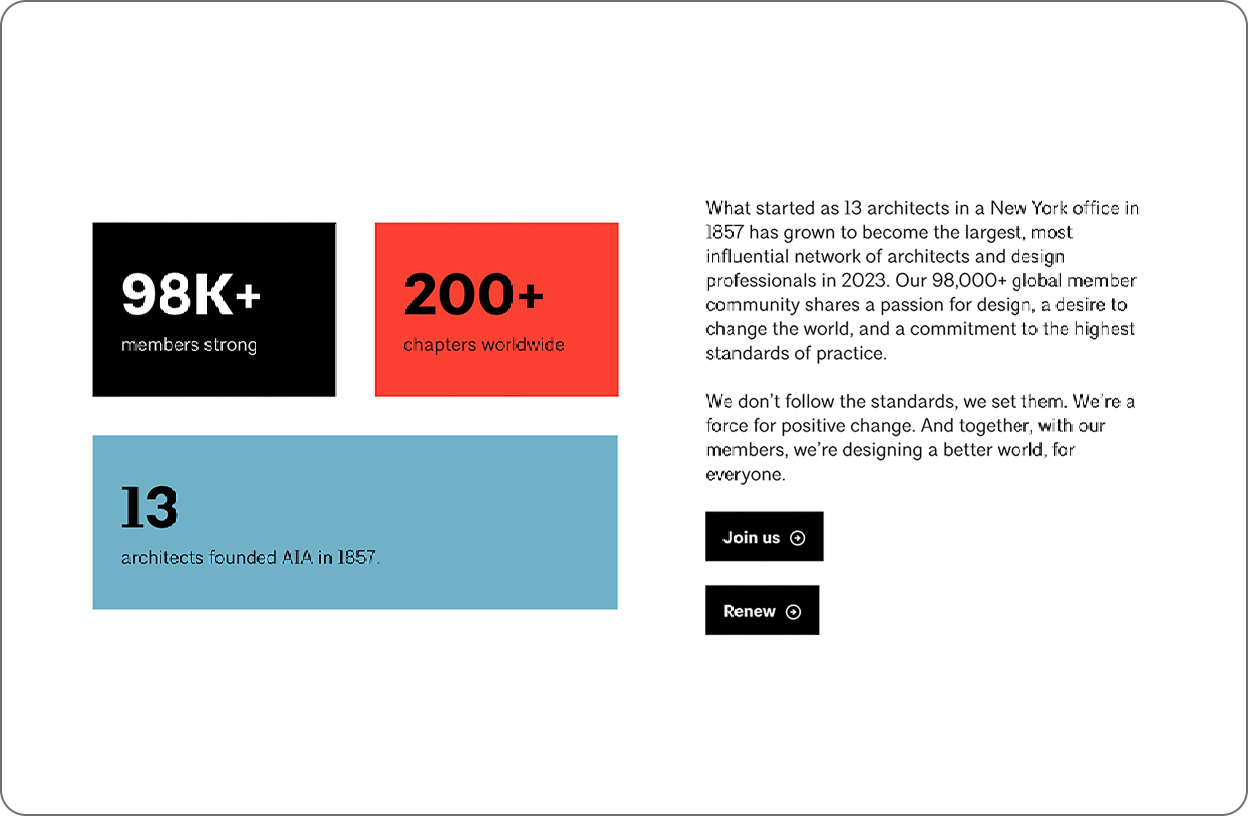
AIA offers a sleek, hardworking website that feels effortless. With its minimalist design and clean grids, it speaks directly to architects. The layout balances compelling marketing and valuable content, all working seamlessly together. Every element is thoughtfully crafted to showcase the value of membership, engage members with useful resources, and effectively represent the industry and organization. AIA doesn’t just tell you who they are—their website shows you.

Confirming Brand Identity Through Content
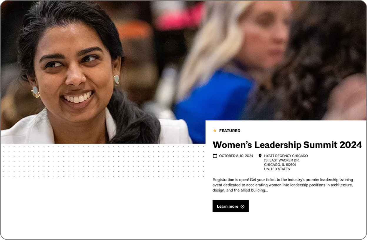
Potential members need to understand who you are and what you offer in the first few moments on your website. Below the hero video, a bold statement succinctly explains the organization’s identity. This aspirational expression of a shared belief frames who should be a member and sets a tone of belonging. Just below, we get a few proof points in the form of the latest news and featured projects. These elements provide clear examples of how AIA is translating their words into action and real-world results.

Back Up Your Claims With Proof
The headline “Build knowledge with exclusive resources” proposes a value proposition, and then six resources serve as proof points to those considering membership.

Navigation That Communicates Priorities
AIA’s collapsed navigation menu speaks volumes about what’s most important to the organization. Short, punchy terms pack messaging into a small space, giving visitors a clear sense of what AIA is about without reading a single word of body copy.
One note for improvement: The navigation terms in the collapsed menu are effective, but the overall navigation at the top of the website has too many items competing for attention. The user isn’t sure where to go first.
Leveraging Design for the Right First Impression
In a world full of distractions and short attention spans, your website design plays a crucial role in capturing attention and keeping users engaged. AIA’s homepage is well-organized, with a clean, minimal design that uses whitespace effectively to highlight key elements. The content transitions smoothly between various formats and sizes, creating a rhythm that keeps users interested.

Build Trust Through Consistency
The website’s interior pages smartly use a modular design system to create unique pages. Designing with a core set of components ensures a consistent experience that is more efficient for users to navigate. Just as importantly, it adds to the perception of professionalism and trust in the organization.
Align Your Imagery to Your Values and Goals
AIA also uses high-quality imagery throughout the website to show the association’s diverse range of members and portray them in a professional way. Each photo serves to humanize the organization and elevate the members and their industry.
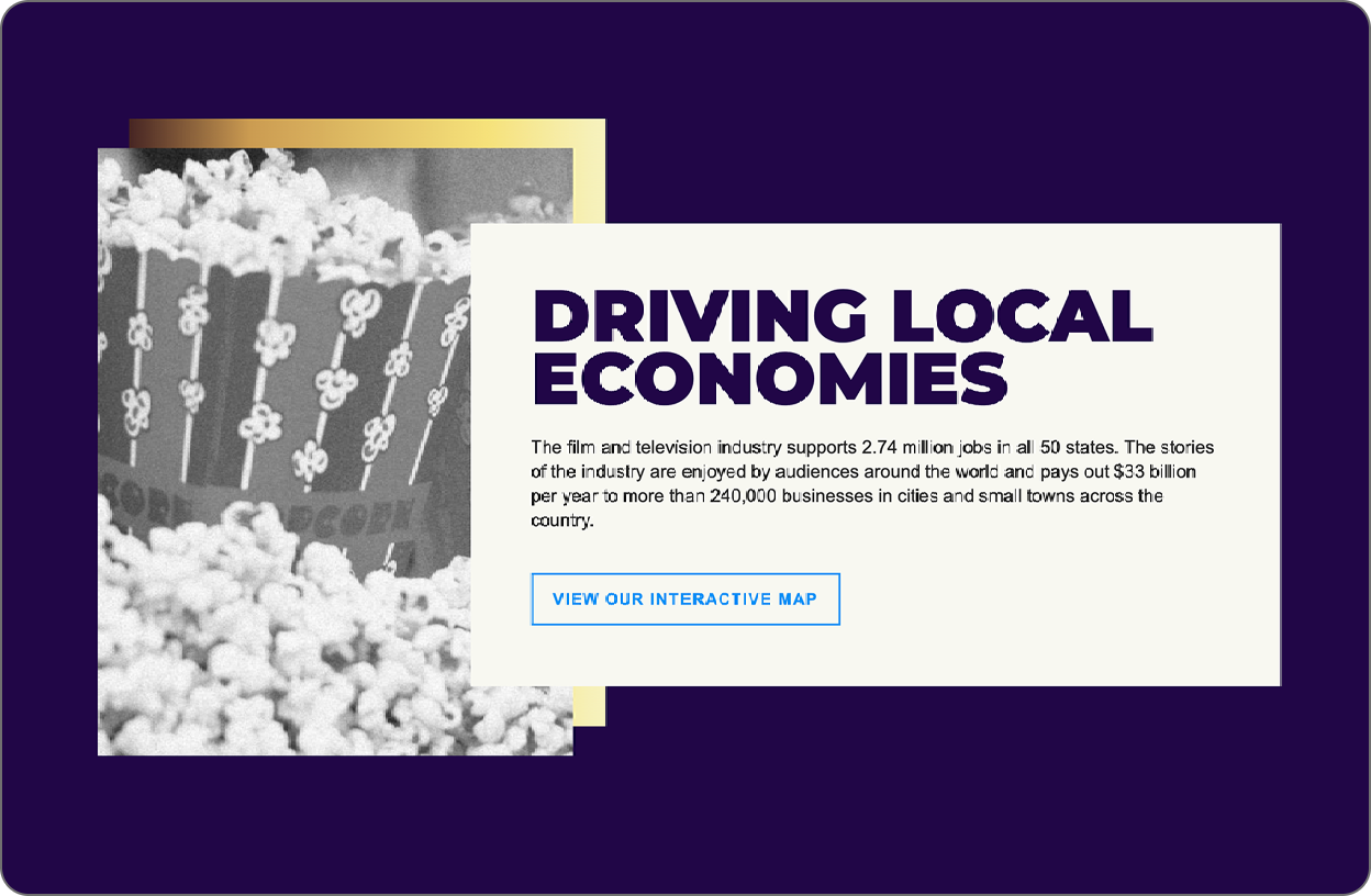
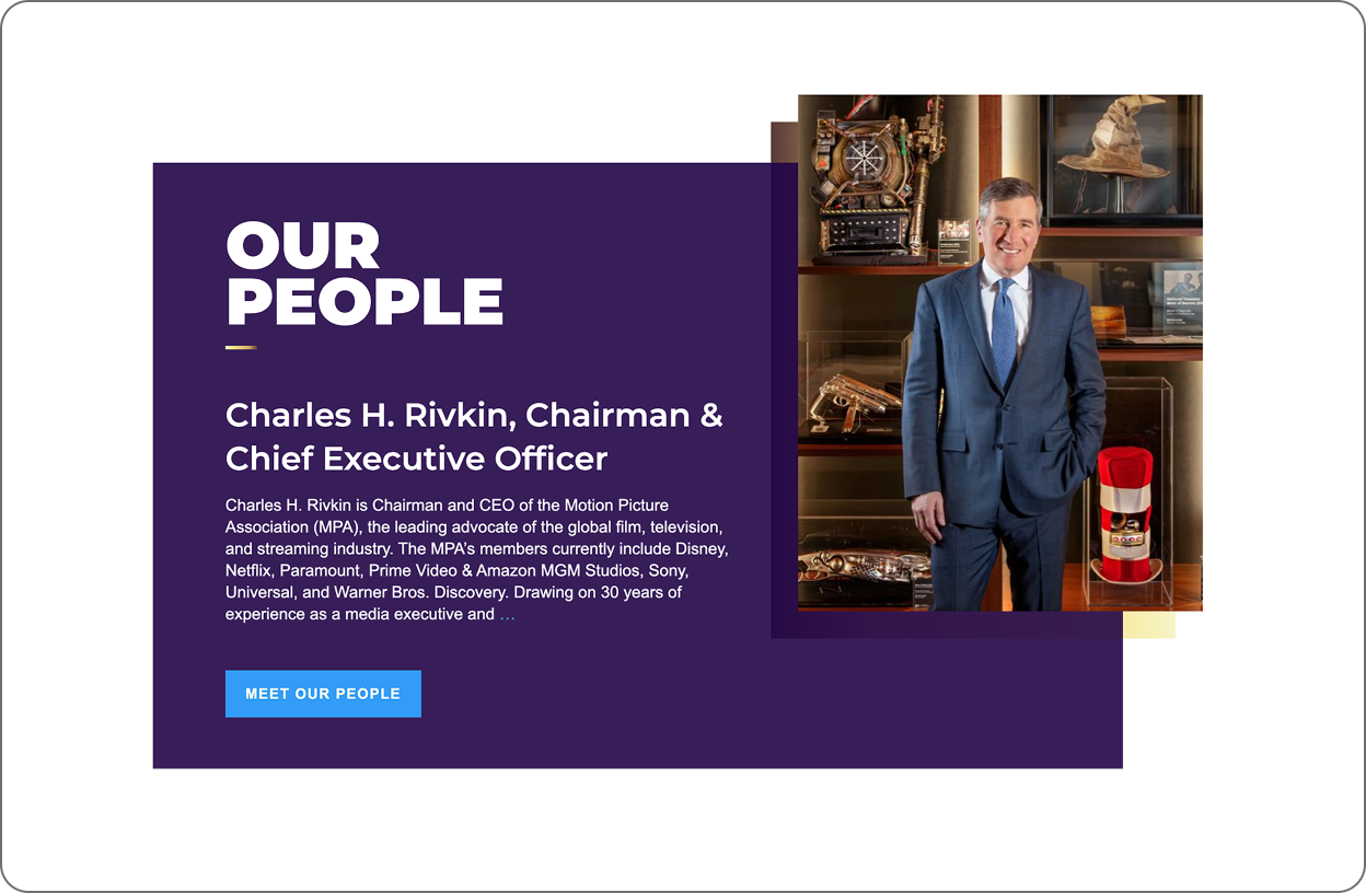
2. Motion Pictures Association
The Motion Picture Association’s website effectively captures the essence of the film, television, and streaming industry around the world while clearly communicating its mission. Strong visuals, focused content, and a clean design engage members and reflect the organization’s professionalism. This simple website delivers an immersive and streamlined experience.

On-Brand Content Strategy
When users visit the Motion Picture Association’s website, they’re instantly immersed in the world of cinema. The site seamlessly blends organizational messaging with timely, relevant content to create a captivating experience. High-quality video from iconic Hollywood films, paired with concise, impactful copy, reflects the organization’s identity while clearly communicating its mission.
Focused Content Delivers a Digestible Message
With only five major sections on the homepage, the Motion Pictures Association achieves a delicate balance. The site is visually captivating without becoming overwhelming, allowing visitors to quickly grasp the association’s purpose and values.

Leveraging Design Best Practices to Compete for Attention
Dynamic layouts marked by rich imagery keep users engaged as they explore the content. The consistent use of white space and a limited color palette provides added energy and focus, guiding visitors’ attention to key information.
Professionalism Through Consistency
A cohesive design approach (typography treatments, color palette and layout compositions) creates a reliable and trustworthy experience for users, reinforcing the association’s professional image as they navigate to different sections.

Suggestions for Improvement
However, MPA’s website still needs improvement. Reorganizing the main navigation down to four to six navigation terms will be less overwhelming to the user and will clearly communicate the organization’s priorities.
3. Entomological Society of America (ESA)
The Entomological Society of America’s website is dynamic and engaging. It showcases entomology through vibrant visuals while providing essential professional resources. The site effectively functions as both a member recruitment tool and an educational resource, reflecting the organization’s commitment to serving the professional and scientific needs of entomologists.

Standout Images and Balanced Messaging
With bold, contrasting colors and standout imagery, ESA declares that this isn’t your grandfather’s bug club. By prominently featuring what its members are passionate about, ESA transforms a niche subject into a powerful design asset.

Maximizing the Impact of Photos
Oversized insect imagery immediately draws the eye, along with professional photos of members in action. The pages artfully blend the association’s focus with the human element of membership. Plus, the design shows a good understanding of how people use websites, scanning and then engaging if they find something interesting.

Depth of Design Elements Maintains Engagement
Consistent use of three image types — close-up nature textures, dramatic bug close-ups, and high-quality member photos — is on message and gives the marketing team a wide variety of assets to work with.

Belonging Through Imagery
Crucially, ESA avoids the pitfall of relying solely on insect imagery. The inclusion of diverse, high-quality photos of members strikes a smart balance, reminding visitors that while bugs are the passion, people are the heart of this organization. This approach not only engages current members but also helps new members envision themselves as part of the ESA community.
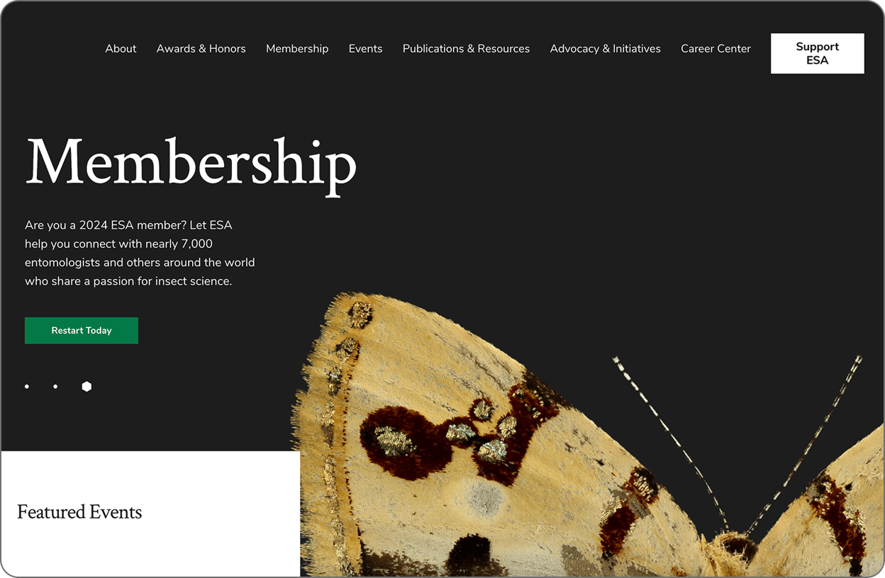
Strategic Design Choices
Large, impactful images paired with concise copy blocks in generous font sizes cater to modern web browsing habits, allowing users to scan and engage with content quickly. Dynamic imagery punctuates key calls to action, guiding visitors toward important information and interactions.

Navigation Leaves Room for Improvement
The ESA website excels at communicating its focus and connecting with members, but its navigation structure still needs attention. The terms are standard for associations, but they could be more effective at communicating ESA’s unique identity and priorities. A more streamlined, distinctive navigation could further enhance the website experience.
Crafting a Website That Elevates Your Association
A great website isn’t just a digital brochure. It’s a powerful communication tool for expressing your value and delivering member benefits.
Creating a website that truly resonates with your members and expresses your association’s story goes beyond aesthetics. It’s about strategically aligning your content, navigation, and design to deliver a cohesive message that speaks directly to your audience.
By understanding which strategies work well (and a few that don’t), you’ll be better prepared for your next website project, one that serves your current members while attracting and inspiring the next generation. If this kind of website redesign will benefit your association, we’d love to help you get started.
4 Warning Signs That Your Brand Has Grown Disconnected from Your Association
Marketing directors at associations have a variety of goals, but two areas constantly demand focus. One, to ensure your organization consistently retains and engages its current generation of members. And two, to grow your organization’s membership. To be successful, you have to clearly illustrate the value of your association to the generation of members still to come.
When your work falls short of these goals, your association faces an existential crisis. But before you examine every marketing initiative to find out what went wrong, consider zooming out and evaluating the state of your organization’s brand.
A good brand system is more than a logo and a set of colors. It’s a toolbox providing the resources necessary to communicate your organization’s purpose in a way that resonates with the right audience. As you look to keep your marketing efforts on track, you must ensure you’re addressing the right problem.

Why a Strong Brand Is Crucial for Member-Driven Associations
An underdeveloped or outdated brand isn’t the reason behind every marketing issue your organization may have. But if your brand is incomplete or out of alignment with your organization’s identity and/or audience, all your efforts will be a struggle.
A strong brand system defines the verbal and visual tools to communicate who you are, what you stand for, and why you exist. Fundamentally, your brand needs the support of a comprehensive system with all the resources to tell your organization’s story.
All communications and marketing should be in sync with your organization’s identity as well as the values of your audience. If your marketing projects are not resonating with members, or if your messaging is inconsistent, a disconnected brand may be the root of your problems.

Warning Signs Your Association Is Disconnected from Its Brand
The following four red flags offer a few signs that your organization needs to focus on its brand:
1. Members or Sponsors Switch to Inferior Competition
Regardless of your association’s audience, current and prospective members have options competing for their dollars and attention. Local, regional, and national alternatives may offer services comparable to your organization, as do more specific or broader professional associations. A healthy brand system gives you the tools to communicate your value effectively, connect with prospective members, and showcase what sets you apart.
When you start losing members or sponsors to other organizations, your brand system may be falling short of your needs. This is especially true if your members or sponsors are leaving for competitors that provide services that are comparable or even inferior to your offerings. Whether your organization offers member education, networking, advocacy, or other services, your brand system provides the building blocks to communicate these benefits effectively. Declining membership could indicate a communication breakdown between your association and its audience.
2. Staff & Stakeholders Explain Your Organization in Different Ways
When your messaging is poorly defined or articulated, your staff and board lack the proper tools to communicate what’s most important about your mission. You, your board, and your employees are all individuals, and how you discuss your association will be shaped by your experience. However, everyone should start from the same baseline when introducing the organization. You should all be able to deliver a cohesive elevator pitch that captures the key elements of your brand narrative.
Typically, a message needs to be repeated five to seven times to be remembered. By having everyone in your organization follow the same core messaging points, you build a consistent narrative that develops a cohesive identity with the audiences you need most.
A strong brand provides your teams with a messaging system that adds clarity and consistency to every expression of what your organization has to offer. It enables your organization to speak in a unified voice, building trust among membership, sponsors, and the public.
3. Marketing Projects Lag Without Adequate Brand Tools
If your brand guidelines include a logo, two fonts, and three colors, your organization lacks the tools to communicate in today’s multi-channel environment. You need a brand system that is robust enough to set your organization up for success regardless of the medium.
You’ll see one of two possible red flags when your organization lacks sufficient brand resources. If you’re steering a tight ship, your marketing projects may start to look boring, uninspired, and basic over time. Or even worse, your creative teams will scramble to reinvent the wheel with each project and start making up their brand components to fill the void. Instead of appearing unified with your communications, your brand becomes a mishmash of disconnected visuals across different channels. Projects will take longer to produce and lack the cohesion required to support your goals.
4. Events Outpace Your Organization for Sponsorship Dollars
Your organization’s events are critical opportunities to connect with current and prospective members. Sometimes, a marquee event takes on a life of its own, with a special look that stands apart from your association. In cases like these, sponsors may spend their money on your popular event while leaving out the wider organization.
Ensure every sub-brand connects with your larger association and adds to your brand story — not compete with it. The success of your events should always be attributable to your organization and remain strongly connected to its overall brand. With a well-planned and robust brand system, your organization has the capacity to build and support multiple complementary sub-brands that are clearly related in support of the same, singular mission.

Create a Cohesive Experience with Your Association’s Brand
Effective design, persuasive messaging, and a strong brand are crucial to associations looking to nurture a strong connection with their audience. Without these elements, your communications will get lost in the noise of a crowded landscape and fail to express the value of membership.
If your organization is struggling to connect with its audience, you should look beyond the surface to examine the state of your brand system. With an experienced partner, you can transform your brand into a powerful communication platform with verbal and visual language that expresses your identity.
If you think you’re noticing red flags and want an impartial third party to assess your brand’s positioning and ecosystem, consider an Impact Analysis. We will audit your brand and prescribe a plan of action, identifying opportunities for improvement and the resources needed to achieve your marketing goals.If this sounds like a resource that would benefit your association, get in touch with us.
6 Design and Content Best Practices to Improve Your Association’s Email Marketing
In an overcrowded media landscape, associations must build a strong connection with their members. But many of the marketing tools at your disposal have a barrier between you and your audience. Social media outreach requires time, talent, and financial investment to navigate complex algorithms. Advertising offers a potentially broad reach, but it requires considerable investment for the right exposure.
Of all the communication strategies available to you, email holds great potential because it is a direct line to your audience. In effect, members and those curious to hear more about your association have invited you in. But what does your association have to offer once you arrive?
Inboxes are competitive spaces with an array of voices vying for the audience’s attention. However, with a strategic approach to content and design, you can break through the noise and deliver a standout experience that nurtures your connection with members now and in the future.
Why Mastering Email Is Vital to Your Association’s Health
Email offers a wealth of opportunities for associations, but it can feel like walking a tightrope. Send too much clutter and your members will unsubscribe or, even worse, flag your messages as spam. Send irrelevant content, and your messages won’t be seen as useful and will become part of the noise.
You need to ensure that the content and design of the emails you send allow your audience to see the value of a direct connection with your association. Factor in the changing demographics of the workplace and the stakes grow even higher. A recent study showed 73% of millennials prefer communicating with brands through email than any other medium.
Email marketing presents a golden opportunity to nurture a connection with members. But it’s a two-way street. Your members signed up to receive messages from your organization because they want curated information from a trusted source to help them succeed.
To ensure you meet these expectations, we’ve assembled the following best practices:
1. Provide a Seamless Experience with Every Email
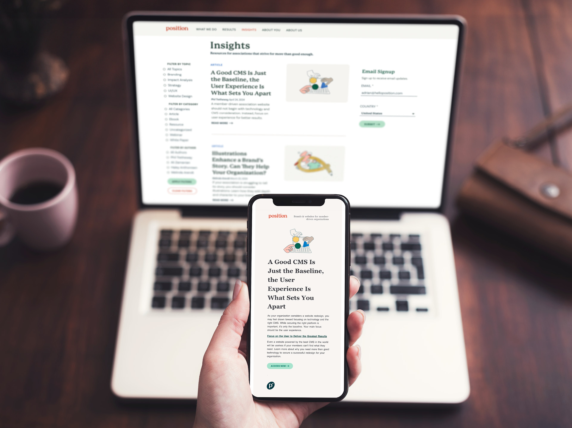
Much like your association’s website, every email should positively reflect and expand upon your brand story. The visual design should be consistent with your organization’s overall brand ecosystem. Your emails will include links that send readers to your website, and what they see on one should function as a fluid extension of the other. A consistent experience will enhance the perception of your brand and build a sense of trust among readers.
2. Understand Your Audience and Their Needs
Your current and prospective members give you their time and attention when they read an email. You have a responsibility to deliver on that investment and make it worthwhile.
Your organization should survey its members about the content they want to receive and consult analytics to track user behavior. That way, you develop a sense of what your audience wants and respond appropriately. Applying personalization, such as using a member’s first name from your database, will help increase email engagement and ensure your members feel valued and seen.
You should also avoid trying to serve every audience with a single newsletter. Comprehensive newsletters quickly become irrelevant if their content doesn’t resonate, and they’re often too long. Instead, create multiple audience segments and deliver customized content for each to ensure subscribers only receive relevant content.
3. Optimize Your Association’s Content for Reality

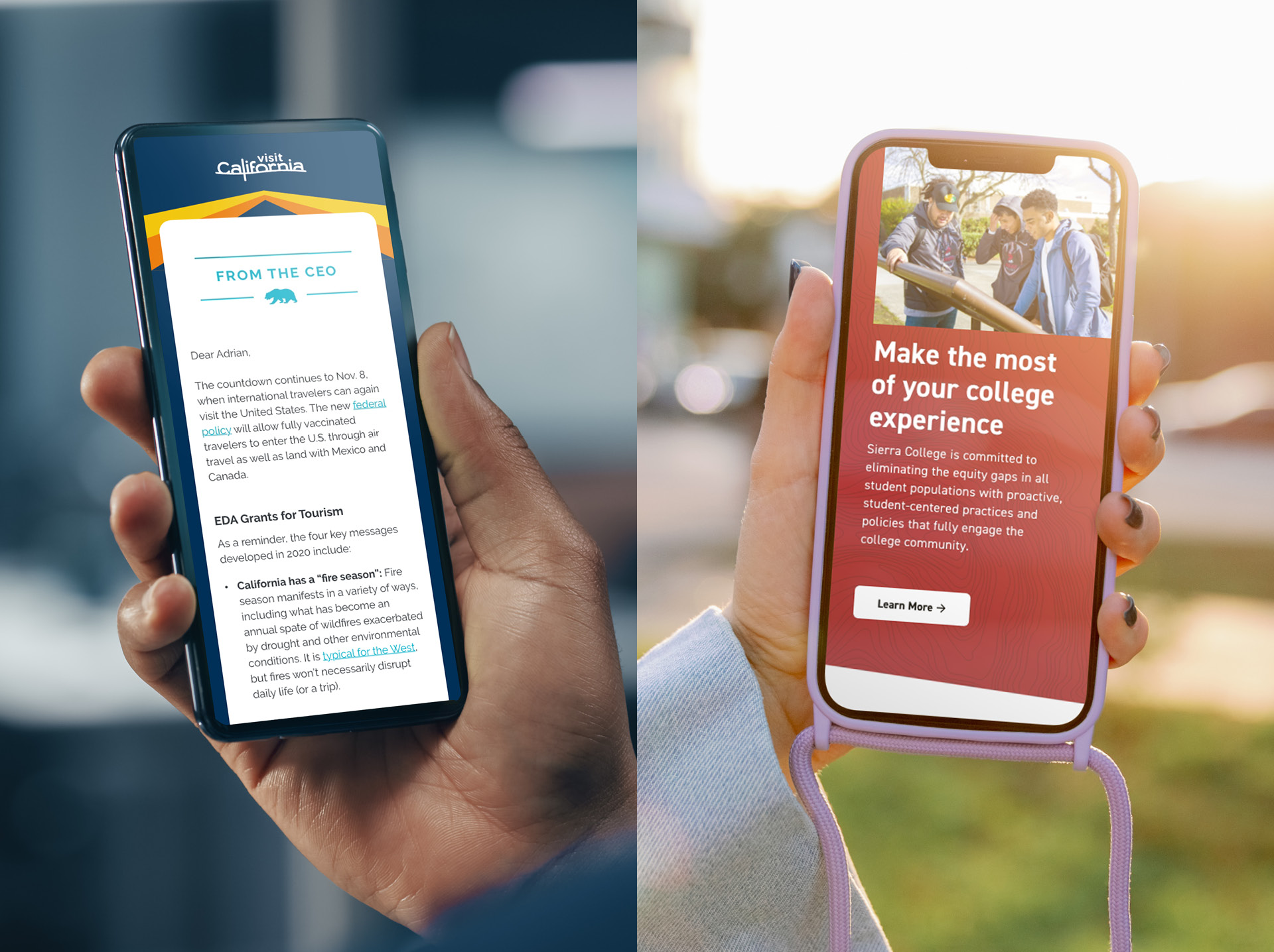
Emails should be short, scannable, and mobile-friendly. More than 46% of all emails are first opened on mobile devices. You need to ensure your designs are responsive to these screen sizes and remain lightweight so they load quickly.
You should never include the full text of a message in a newsletter unless it’s a one-off announcement or update. Instead, give your content an engaging headline with a one- or two-sentence description, followed by a button guiding readers to read more. Along with providing a digestible amount of content, you also gain analytics data on what is resonating with your audience.
4. Leverage Effective Design
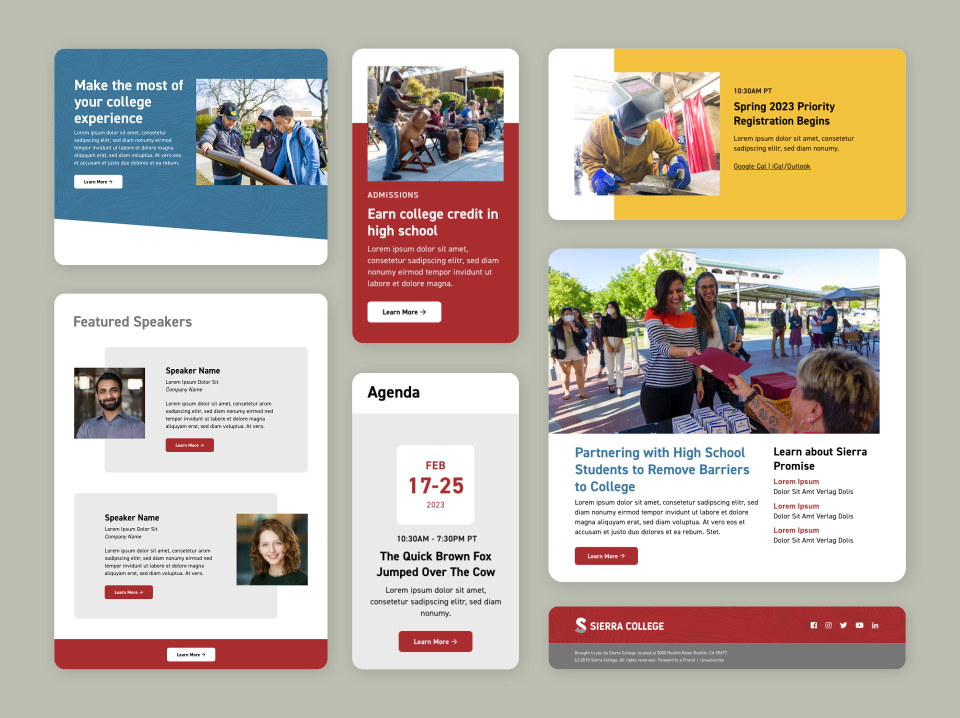
Email design isn’t a one-size-fits-all endeavor. Creating templates with multiple modules optimized for different content types, such as articles, event announcements, news, etc, helps your messages stand out.
Whatever type of email you send, the content must be useful and easy to read. Design practices such as retaining an appropriate amount of white space in each message will ensure your emails appear light, airy, and inviting.
5. Use Strong Visuals Appropriately
Images enhance the storytelling in your email and engage your readers. Infographics provide engaging opportunities to express information in a persuasive, scannable way. Animated GIFs will also catch your reader’s eye, but they should be used sparingly and primarily as header images, as they can be overwhelming.
However, your email should not be one large image. Services like Gmail will identify these messages as spam and block your visuals by default. You should avoid putting text in images when possible, as images are often turned off by default in many email programs. When you can’t avoid it, be sure to add alternative text to those images — this ensures you are compliant with accessibility guidelines, and your message will still be understood if they don’t load properly.
6. Send Useful, Actionable Messages That Meet Legal Standards
Email is a powerful tool, but that power is effectively a double-edged sword. Don’t send enough, and you’ll be forgotten. Send too many, and you’ll likely annoy and eventually lose the audience you need most.
Worse yet, your IP address may be blacklisted for not complying with CAN-SPAM requirements, which is difficult to resolve and could also lead to legal action. You should always make the unsubscribe link easy to find to avoid alienating your members and being marked by readers as SPAM.
Whether inviting members to a gala, encouraging a renewal, or sharing professional resources, you should never email your members without a clear and compelling purpose. Before sending an email, ask the following question: What’s in it for your members? If you apply this simple guideline to your email marketing, you’ll nurture a lasting connection that will continue to serve your association’s goals.