

The Branding Process: How We Approach Building a Successful Brand
When organizations start thinking about branding, the conversation often begins with the visible parts. The logo feels dated. The colors feel tired, the materials feel inconsistent, or the brand no longer seems to connect with the people it needs to reach.
Those concerns are legitimate. The visible parts of a brand matter because they shape first impressions and influence how people perceive the organization. But in most cases, they are pointing to something deeper.
The organization may have evolved while the brand stayed in place. The audience may have changed. The things people value most about the organization may no longer be reflected in how it presents itself. Internally, teams may be describing the organization in different ways or emphasizing different aspects of its value. What looks like a design problem is often a sign that the brand no longer reflects the organization’s identity, audience, or future direction.
The goal is not simply to create a better-looking brand. It is to create a brand that accurately reflects who the organization is today and where it is headed next.
That is why our branding process is not just about crafting a new aesthetic. It is about uncovering what makes an organization valuable, distinct, and meaningful to the people it serves, then building the strategy, messaging, visual language, and tools needed to express that clearly and consistently. The goal is not simply to create a better-looking brand. It is to create a brand that accurately reflects who the organization is today and where it is headed next.

Start With Clarity
Every organization already has a perceived brand. People are always forming opinions about whether the organization feels credible, relevant, trustworthy, modern, approachable, or valuable.
A rebranding process helps shape that perception with more intention.
Before we begin to design a logo, we need to understand the current state of the brand and where it is going. That means listening to leadership, staff, members, customers, partners, or other stakeholders. It means reviewing current materials, studying the competitive landscape, and identifying where the brand is creating strength, confusion, or missed opportunity.
This stage is important because it defines the problem before the creative team starts solving it. Strategy does not replace creative thinking. It focuses it. A clearly defined problem gives design more meaning and gives the entire process a stronger foundation.

Create Organizational Alignment
The best branding projects are not simply marketing projects. They are organizational projects.
Leadership involvement matters because the brand should reflect the direction of the organization, not just the preferences of a marketing team. When leadership is engaged, the brand is more likely to feel true to the organization’s vision and future direction. It also signals that the work is important and worthy of support across the organization.
But leadership buy-in alone is not enough. A successful brand requires broader organizational alignment. Staff, board members, volunteers, and other stakeholders all play a role in shaping how the organization is experienced. When they understand the reasoning behind the brand and see themselves reflected in it, adoption becomes much easier.
When they understand the reasoning behind the brand and see themselves reflected in it, adoption becomes much easier.
Without that alignment, even strong creative work can struggle. The brand may launch, but may face adoption challenges. Teams keep using old language, departments interpret the brand differently, and the brand system slowly fragments. When alignment is strong, the brand becomes more than a set of guidelines. It becomes a shared understanding of who the organization is and where it is headed.

Build a Shared Language
Visual identity often gets the most attention, but messaging is one of the most important parts of a brand system.
A strong messaging system gives people a consistent way to explain who the organization is, what it does, why it matters, and how it creates value. It does not force everyone to speak from the same script. It gives them a shared source of truth they can draw from in different situations.
This is especially important for organizations with multiple departments, audiences, chapters, programs, partners, or member segments. Without shared language, everyone starts improvising. The website says one thing, the sponsorship deck says another, and leadership may describe the organization in a completely different way.
When messaging works, people may use different words, but the underlying story feels consistent. That consistency builds trust.

Give the Brand Form
Once the strategy and messaging are clear, the visual identity has something meaningful to express.
This is where creative work matters deeply. A brand needs to be recognized, felt, and remembered. It needs character, emotion, and a point of view. Without that, a brand may be attractive, but it will not be resonant.
A strong visual identity is not decoration layered on top of strategy. It is strategy made visible.
A strong visual identity is not decoration layered on top of strategy. It is strategy made visible. The logo, typography, color palette, imagery, patterns, icons, and supporting design elements all work together to communicate something before a person reads a single word.
The goal is not simply to stand out. Campaigns are often built to stand out. Brands need to resonate and stand the test of time. They need to feel believable, human, and true to the organization.
People do not build relationships with positioning statements. They build relationships with personalities, values, beliefs, and experiences. That emotional connection is what helps create loyalty.

Make the Brand Useful
A brand system should make work easier.
This is one of the biggest lessons we learned from years of designing within other organizations’ brands. Some brands are inspiring at launch, but difficult to apply. Others are clear, flexible, and practical enough that teams actually want to use them and do so effectively.
A useful brand system gives people tools. It includes the reasoning, guidance, examples, assets, and systems that help teams produce consistent work without having to start from scratch every time.
This matters because brands live across many touchpoints: websites, presentations, campaigns, emails, social media, signage, events, reports, recruitment materials, and everyday communications. A logo and color palette cannot carry that much weight on their own.
A complete brand system gives the organization more range. It creates consistency without making everything feel the same. It helps internal teams and outside partners build from the same foundation.

Help People Carry It Forward
The internal rollout is often one of the most overlooked parts of branding, and one of the most important.
A brand is not successful because the guidelines are approved or the website launches. It is successful when the people inside the organization understand it, believe in it, and know how to express it.
Staff, leadership, board members, and key stakeholders need to understand why the changes were made and how to start using the new brand. They need practical guidance, but they also need context. They need to see how the brand connects to the organization’s direction and their role in bringing it to life.
The people inside the organization are the ones who live the brand. Their cumulative actions shape perception. Every conversation, presentation, email, event, member interaction, and leadership decision contributes to how the brand is experienced.
When those people are aligned and equipped, adoption happens faster. The brand has more energy behind it. It feels less like a mandate and more like something the organization can carry forward collectively.
When the Process Works
A successful brand is not just something people recognize. It is something people understand, believe, and use.
You can see it working when a volunteer at your conference describes the organization in a way that aligns with the sponsor deck. When a board member talks about the value of membership in the same spirit as the new member orientation and the annual gala welcome speech. When leadership, staff, vendors, and partners are not repeating the same exact words, but are clearly expressing the same underlying idea.
That is when the brand becomes more than a visual identity. It becomes an aligning force.
That is when the brand becomes more than a visual identity. It becomes an aligning force.
The visible parts of branding will always get the most attention because they are easiest to see. But the success of a brand depends on the work underneath: the clarity, messaging, visual language, tools, and internal adoption that allow an organization to show up with consistency and confidence.
Handled well, branding does not just change how an organization looks. It helps the organization better understand itself, express itself, and move forward with more focus.
Modernizing a Legacy Brand Without Losing Your Roots
The Tension is Real, and it’s Justified
There’s a particular kind of tension that shows up when an association starts talking about a rebrand. Leadership can see the gap. The brand hasn’t kept up, it feels dated, and it no longer reflects the quality of the organization or resonates with newer members the way it once did. At the same time, there’s a real hesitation to touch it. The logo has often been around for decades, and it carries meaning. For many members, it is not just a visual mark. It represents a long-standing relationship with the organization and, in some cases, is a part of their professional identity.
Rebranding a legacy organization, then, is not just a design exercise. It is a strategic decision that influences how people perceive the organization, how they connect with it, and whether they continue to feel a sense of ownership. Most of the concern is not about whether the new design will be good. It is about whether it will be accepted.
What often gets overlooked in that hesitation is the assumption that there’s no real cost to waiting.
If the brand isn’t working, it is already affecting the organization. It shows up in member attraction, retention, and engagement, but often in ways that are hard to see or measure directly. The organization becomes less relatable. It starts to feel out of touch.
Over time, that compounds. Organizations that avoid evolving their brand don’t stay relevant. They fade away. They become easier to ignore, harder to connect with, and less relevant to the people they need to reach. And when that happens, it raises a more practical question. Who wants to join, get involved, or associate their own personal or organizational brand with something that feels stale or neglected?
Those concerns about change are valid. But avoiding it comes with risks of its own.
Our Take on Branding
At Position, we define a brand simply: “A brand is a consolidation of what people think – their perception of you, your product, or service.”
“A brand is a consolidation of what people think – their perception of you, your product, or service.”
It’s not just a logo or a tagline. The contents of your brand guidelines do not define your brand. They are tools used to guide, shape, and inform how your organization shows up in the real world, in a well-informed attempt to influence perception.
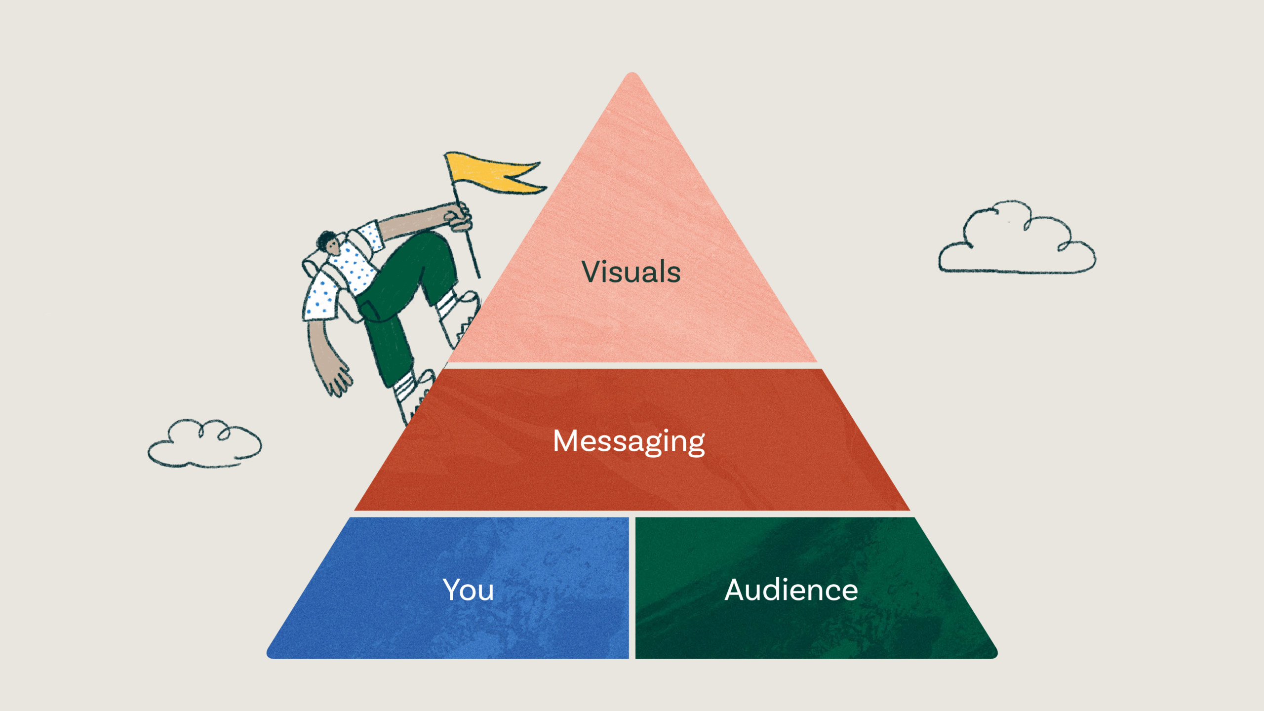
That distinction matters because it changes how you approach the work. We believe, “Branding is the process of discovering and articulating your identity.”
“Branding is the process of discovering and articulating your identity.”
Crafting the verbal and visual language of a brand is about translating who you are into a language that speaks to your audience. It’s about identifying what makes the organization meaningful and expressing that clearly and consistently.
When a brand is thought of as just a logo, it becomes a conversation about taste. People debate what they like instead of what the organization needs. That usually leads to safer, more subjective decisions, and in the end, the brand may change visually without improving how it connects or performs.
For legacy organizations, that risk is amplified. You’re not starting from scratch. You’re working with decades of brand equity, reputation, and trust. When decisions are driven by preference instead of purpose, it becomes easy to overlook what made the brand meaningful in the first place. The goal is not to replace that. It’s to better express it in a way that resonates with the audience you need to reach today.
There are Three Reasons to Rebrand
Once the definition is clear, the next question becomes whether a rebrand is actually needed, and if so, why.
In most cases, the reasons tend to fall into three categories.
- Something fundamental has changed. The “what, why, or how” of the organization is different. Services have evolved. Delivery has changed. In some cases, the organization has fundamentally redefined its role. A brand built for the past version of the organization can’t accurately represent what it has become.
- Who you serve has changed. The audience is different, or it behaves differently. Longtime members may be retiring, while newer generations come in with different expectations. They are digital natives. They’ve grown up with well-designed products and experiences. The bar for how organizations communicate and present themselves has been raised.
- The brand is no longer performing. It may feel dated, unclear, or disconnected from the organization it represents. It can struggle to function across modern channels or communicate effectively in a competitive environment. Over time, incremental changes and iterations often drift away from a shared strategy, leading to confusion.
In our work, this third scenario is the most common, and it’s usually diagnosed correctly. Organizations can feel when the brand isn’t holding up, even if they can’t always articulate why.

Sometimes it shows up in practical ways. When we worked with the California Society of Anesthesiologists, the logo was designed for a simpler time. It didn’t scale well, didn’t reduce cleanly, and didn’t function in digital environments. The issue wasn’t strategic. It was practical.
In other cases, the change is more structural. Downtown Sacramento Partnership was undergoing a significant shift, refocusing from serving a more traditional base of property owners to attracting younger, more entrepreneurial residents seeking an active, urban lifestyle. That required a full rebrand, not just an update.


And sometimes it’s a combination. Visit Sacramento had expanded its audience and its marketing of the destination. The existing brand was well-liked, but it no longer reflected who they were trying to reach or how they were positioning themselves. The “what” and the “who” had evolved, and the brand needed to follow.
When one or more of these conditions are present, the brand is no longer doing its job. The question is not whether to change, but how.
Cleanup vs. Evolution vs. Redesign
Modernizing your brand is not a single, fixed approach. There are different levels of change, and choosing the right one depends on what the organization actually needs.
Redesign
In some cases, a full redesign is the right move. This typically happens when there has been a fundamental shift in the organization or its audience, and the existing brand can’t stretch to accommodate it. Here, you are rebuilding the brand as a system, including positioning, messaging, and visual identity.
Evolution
In legacy organizations, the right approach is often brand evolution. This is where the core ideas of the brand are still strong, but it isn’t firing on all cylinders. The goal is to modernize, refine, and expand what exists without throwing away the equity that has been built over time. This doesn’t necessarily mean the work is quicker or easier. In many cases, it is more challenging because you are working within inherited constraints while trying to move the brand forward.
Cleanup
At the most tactical level, there is brand clean-up. This is focused on functionality rather than strategy. A logo needs to function across modern environments, scale cleanly, and meet accessibility standards. These are practical considerations that can be addressed without rethinking the brand visuals at a strategic level.
The challenge is that organizations often default to the simplest option, even when the problem is deeper, or they jump to a full redesign without understanding what should be preserved. The right decision is usually made after the discovery process, when there is clarity on what is working, what isn’t, and where the opportunity lies.
Everything but the Brand
When working with a legacy brand, the process around the work is as important as the work itself, and in many cases, it matters more.
A legacy brand should be handled with care. It represents years, sometimes decades, of accumulated equity and trust. For members, it can feel personal.
Where rebrands tend to struggle is not just in the design, but in how the organization approaches the work. When branding is treated as a marketing initiative instead of an organizational one, it often doesn’t get the level of attention or alignment it requires. The right people aren’t involved. The perspective is too narrow. And the outcome reflects that.
That usually shows up early. Before any design work begins, there’s already a lack of clarity around why the rebrand is happening and what it needs to accomplish.
Because of that, the first step is not design. It’s alignment.
You need to clearly explain why the organization is undertaking a rebrand. This is not about dismissing the existing brand or suggesting it is “bad.” It is about positioning the organization for the future and making sure it can continue to connect with members in a changing environment.
From there, involving members and stakeholders in discovery becomes critical. Discovery is not just about developing a deeper understanding of the organization, the audience, and the challenge. It is also about giving people a voice.
Surveys, focus groups, and interviews create space for different perspectives to shape the direction. When people feel like they have been heard and that their input has contributed, they are far more likely to support the outcome and, in many cases, help champion it.
Nailing the Brand
When it comes to crafting the brand, there is a level of balance and finesse that is difficult to get right without experience.
How much of the organization’s history should be retained? How far should the brand be pushed to better reflect the future? What elements should carry over, and which should be left behind? These decisions define the work, and they are rarely straightforward.
In branding, we are looking for “what has always been true, is true today, and will be true in the future.”
“what has always been true, is true today, and will be true in the future.”
When you can identify this core truth and articulate it in a way that feels native to the organization and relevant to the audience, you have the foundation for a strong brand. With legacy organizations, there is added importance placed on understanding what has always been true. That history need not be a constraint. It should be an asset.
A common mistake at this stage is assuming those answers are already known. Teams often come in with an idea of which elements to carry forward, based on assumptions or a handful of conversations. In practice, those decisions require more rigor and should be informed by research, not just assumptions and recollections.
The messaging system needs to speak to the current audience without losing the values that have carried the organization forward. Visually, the same balance applies. Carrying forward one or two intentional elements can create continuity while allowing the brand to evolve in a meaningful way.
Avoiding the Half-Step
One of the most common ways rebrands fall short is by only addressing part of the problem.
The most common version of this is launching a new campaign rather than addressing the brand itself. Organizations know something isn’t working, but a full rebrand feels like too much risk, so they try to reframe the organization through a campaign. It creates a shallow, temporary lift, but the underlying issues remain.
The second common half-step is redesigning the logo without addressing the messaging behind it. The visual changes, but it’s not backed by meaning and narrative. The brand may look more current, but it doesn’t connect any better.
A brand works as a system. Its effectiveness comes from the alignment between how it looks, how it sounds, and how it shows up across touchpoints. If the goal is to modernize in a meaningful way, the work needs to be cohesive and complete enough to resolve the issue it aims to address.
A More Grounded Way to Move Forward
One of the most common misunderstandings in a rebrand is treating it as a marketing initiative instead of an organizational one.
As a reminder, “A brand is a consolidation of what people think – their perception of you, your product, or service.”
That perception is shaped by more than messaging or design. It comes from how the organization operates, what it prioritizes, and how leadership shows up. If the rebrand isn’t aligned with that reality, it struggles to hold up over time.
At the same time, avoiding the work or only addressing part of it carries its own risk. Brands that aren’t evolving don’t stay in place. They become less relevant, less relatable, and harder to connect with.
Modernizing a legacy brand is not about abandoning what made the organization successful. It’s about understanding it well enough to carry it forward. Whether the right approach is a full redesign, an evolution, or a clean-up, the decision should be grounded in a clear understanding of what has changed and what hasn’t.
Handled well, modernizing a legacy brand doesn’t break from the past. It builds on it, aligning what has always been true with what the organization needs to become.
How Color Choices Can Improve Accessibility on Your Association Website
Designing a website for an association requires more than just visually appealing aesthetics. Accessibility and usability are critical factors that ensure your website serves all members, including those with disabilities. Among the elements that influence accessibility, color choices play a pivotal role. The right color decisions enhance the user experience and ensure your association’s website complies with the Web Content Accessibility Guidelines (WCAG), making it inclusive for all users.
The Importance of Website Accessibility for Associations
In recent years, Diversity, Equity, Inclusion, and Accessibility (DEIA) has become a priority for many associations. Accessibility is a crucial consideration for member-driven organizations, as it ensures all members can interact with your website. For associations, website accessibility isn’t just a best practice; it can protect you from lawsuits.
The Web Content Accessibility Guidelines (WCAG), developed by the World Wide Web Consortium (W3C), are the international standard for ensuring website content is accessible to all users. Most association websites aim to meet WCAG Level AA compliance, which ensures accessibility for users with visual impairments, such as color blindness and low vision. Understanding how people with visual impairments experience your website can help you identify areas for improvement. Try this color blindness simulator to see your content through their eyes.
The Importance of Planning for Accessible Colors
While color contrast guidelines can initially seem restrictive, thoughtful planning enables dynamic, visually compelling designs that are also accessible. When developing or updating your association’s brand color palette, it’s important to include a full range of colors: dark, medium, light, and neutrals. A robust palette ensures flexibility for a variety of applications, such as event visuals, sub-brands, and complex website layouts, without sacrificing accessibility.
Building Color Palette to Support Accessibility
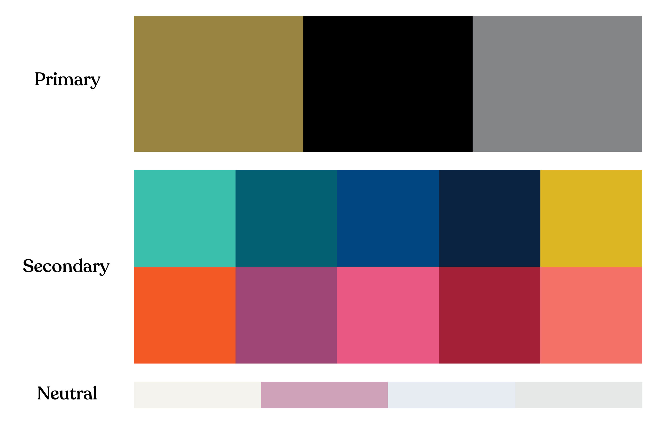
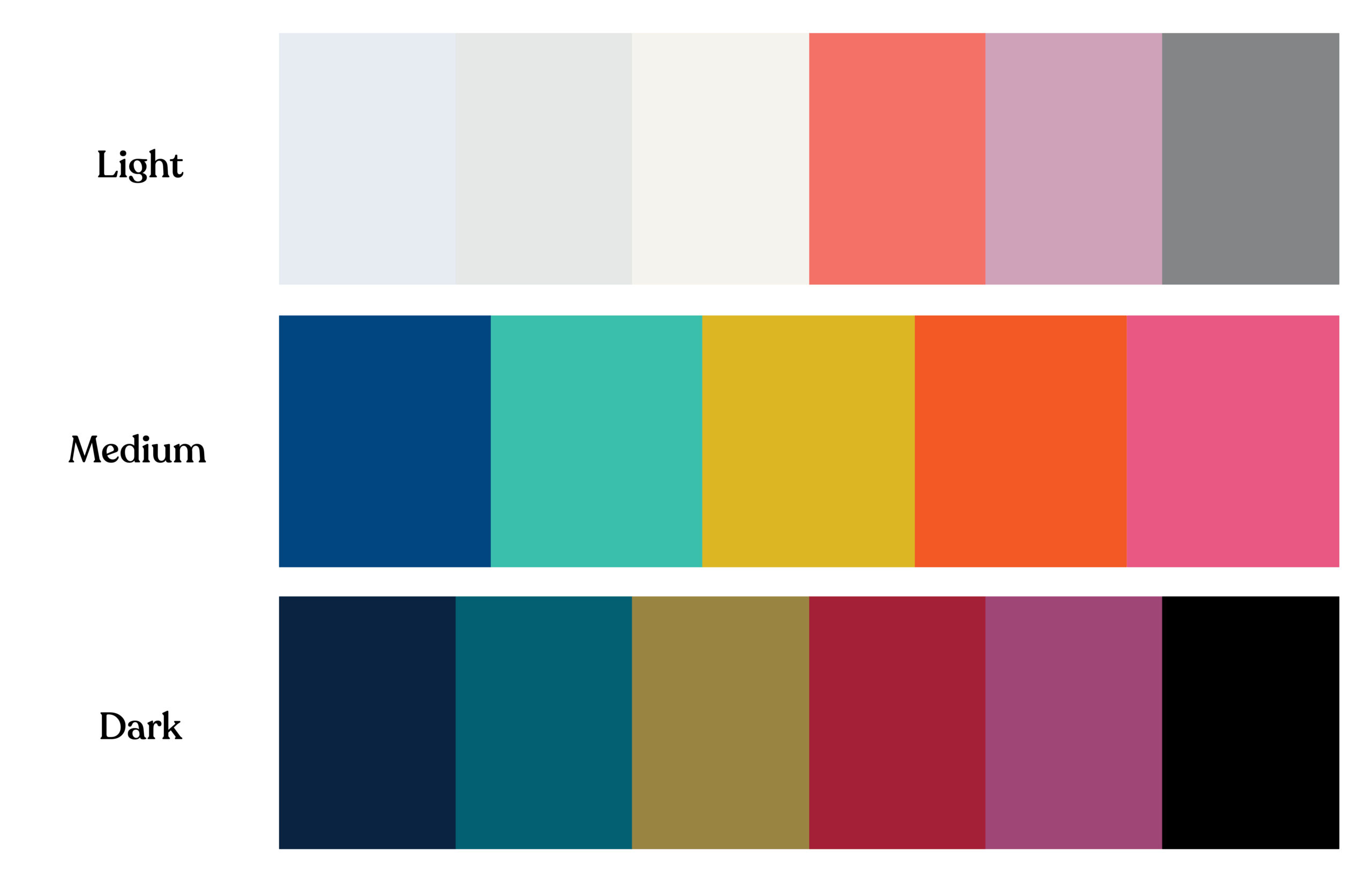

Taking the extra step to test the contrast ratios of your color pairings early in the process ensures that they meet accessibility standards. This approach helps confirm that your colors can be used effectively across different design elements, like text, buttons, and call-out boxes, while maintaining compliance with ADA or WCAG guidelines. With intentional planning, you can achieve designs that are both creative and inclusive.
Understanding the Impact of Color on Accessibility
Color choices on your website significantly affect its accessibility. For example, poor color contrast can make your content difficult to read for users with visual impairments. According to WCAG Level AA standards, text should have a contrast ratio of at least 4.5:1 for normal text and 3:1 for larger text to ensure readability for all users.
Some common areas where color contrast issues often arise include:
- Text over images or videos: Text placed on top of images or video backgrounds can become unreadable if the contrast between the text and the background isn’t sufficient. It’s essential to check that the text remains legible, regardless of the background.
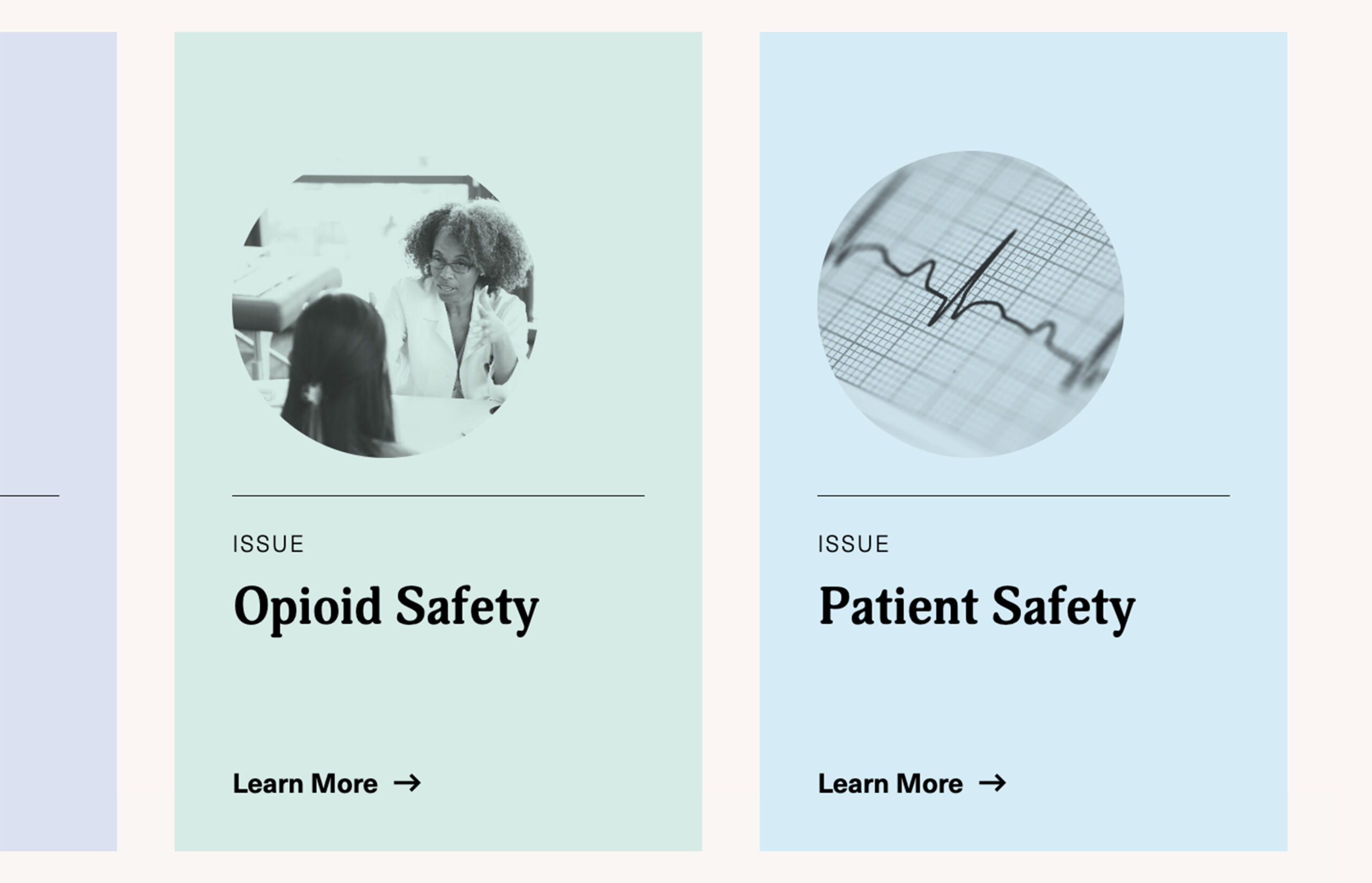
- Call-out boxes: Using mid-tone colors for call-out boxes can lead to poor contrast between the background and the text. Opt for either dark or light backgrounds paired with high-contrast text to ensure readability.
- Buttons and navigation elements: Vibrant colors are often used to make buttons stand out. However, if the contrast between the button’s background color and the text is too low, some users may struggle to read it. Similarly, relying solely on color to identify links can make it difficult for users with color blindness to navigate your website.
Do’s and Don’t’s




Legal Risks of Non-Compliance
Failing to comply with color accessibility guidelines can have legal repercussions. ADA-related website accessibility lawsuits are on the rise, and non-compliance with WCAG standards can expose your association to legal action. Associations are particularly vulnerable due to the public-serving nature of their websites. Ensuring your color choices adhere to WCAG guidelines mitigates legal risks and demonstrates your commitment to inclusivity.
Best Practices for Choosing Accessible Colors
To create an accessible and visually appealing website, associations should follow best practices when it comes to color. Here’s how you can ensure your color choices are both compliant and user-friendly:
1. Test Color Contrast Early and Often
Testing your color contrast during the design phase is crucial. Tools like WebAIM Contrast Checker allows designers to measure contrast ratios and ensure that all color pairings meet WCAG Level AA standards. Testing regularly throughout the design process helps avoid costly revisions later.
2. Design for Mobile Accessibility
With many users accessing association websites via mobile devices, color contrast must be tested across different screen sizes. Website elements can shift or scale on smaller screens, making color contrast appear differently than on desktops. To ensure readability and accessibility, your design team should test how colors display on all devices.
3. Avoid Using Color Alone to Convey Information
WCAG emphasizes that information should not rely solely on color. For instance, if you use color-coded charts or infographics, ensure that there are additional markers, such as patterns or labels, to distinguish between different data points. This ensures that users who cannot perceive color differences can still understand the information being presented.
For example, in a pie chart showing different membership categories, don’t rely solely on colors to differentiate segments. Instead, add patterns, distinct shapes, or labels directly on the chart to make it clear which segment corresponds to which category.
4. Consider Cognitive Disabilities in Your Color Choices
Color choices can affect not only users with visual impairments but also those with cognitive disabilities, such as ADHD or dyslexia. Bright, overwhelming colors can make it difficult for users to focus on content, while inconsistent color patterns can create confusion.
5. Continuously Test and Reevaluate Your Color Choices
Accessibility isn’t a one-time fix—it’s a continuous process. As you update and edit your website, be sure to regularly test new content for color contrast and accessibility. Implementing a regular color audit process ensures ongoing compliance and improves the user experience for all visitors.
Color Choices Empower Accessibility
Color plays a critical role in the accessibility and usability of your association’s website. By making thoughtful color choices and adhering to WCAG guidelines, you can ensure that your website is both visually appealing and inclusive for all members. Prioritizing color accessibility isn’t just about meeting legal requirements—it’s about creating an experience that serves all users, regardless of their abilities.
Tips for Building Better Pages on Your Association Website
Association marketing teams face a unique challenge after launching a new website. Your team is responsible for planning, publishing, or approving any new pages, while protecting its design integrity and the strategy it was built upon. These new pages need to perform at the same high level as the rest of your website.
We have seen many internal marketing teams consistently put significant effort into developing content (program, services, campaign, etc), but fall short in the delivery of that information when it comes time to add it to the website. This disconnect hinders your communications and marketing efforts and contributes to a steady decline in your website’s user experience.
To prevent this, it’s crucial to follow a few key best practices when creating new pages. This will ensure your website continues to support your association’s goals while delivering a seamless experience for your users.
Understand User Intent and Behavior to Inform Page Layout
Aligning any new page with how users will interact with your content is the first step toward creating an effective, user-friendly design. Your association’s website pages should be organized to support one of three key user behaviors:
1. Browsing
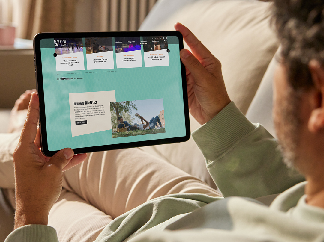
When users browse high-level pages, they’re deciding whether to engage further. Website pages such as member benefits, services, event pages, or special initiative landing pages demand easily scannable, bite-sized content.
Users typically will first skim headlines, photos, pull quotes, and graphics before committing to reading body copy or clicking links. You should provide plenty of scannable elements on browsing pages to increase engagement opportunities.
A single column of dense text can look daunting to your users who haven’t committed to digging deeper yet. Breaking information into digestible chunks and/or multi-column layouts allows them to find information faster. Users often browse information in a non-linear fashion, so organize your content accordingly.
2. Researching

Users engage with these pages once they are interested enough to dig deeper into your website to find specific information. Pages such as articles, resources, or event details target a motivated audience, and the layout should enhance their experience.
Clear, compelling headlines and subheadings remain important to guide users to information. You should also enhance the page’s content with photos, videos, and other graphics to explain concepts that words alone may not be able to convey.
3. Action

When users reach a page intended to drive a specific action, your layout needs to get out of their way. Action-oriented pages like newsletter sign-ups, member registration, or event registration forms should feature a direct, less-is-more approach. You’ve already sold your users on what you have to offer, so keep the page focused on the desired action.
Key Design Principles for Building Effective Pages
Once you understand your user’s goals, you can build a page that will deliver an effective user experience. Depending on your website, your CMS may have tools in place to enhance how your page looks and functions.
For example, WordPress includes Gutenberg blocks that your team can use to create page layouts. When you work with Position, we go a step further and build a custom set of common layout elements so new pages seamlessly integrate with the rest of your website.
Most new pages begin with a cut-and-paste from a text document. But you can’t stop there. The first step to creating visual interest is using headlines and subheads to create a visual hierarchy. Then, incorporate one or more images to add aesthetic value while also enhancing and reinforcing your content. The types of images you choose reinforce your content while also enabling members to see themselves in your brand.
For many pages, a clear headline structure and the right image or two are enough to be effective. For more complex pages, especially those designed for browsing, consider using columns, image galleries, and videos to organize your content in a digestible, logical way.
To elevate your page layouts and create a more intuitive and engaging user experience, consider these fundamental design principles:
Hierarchy
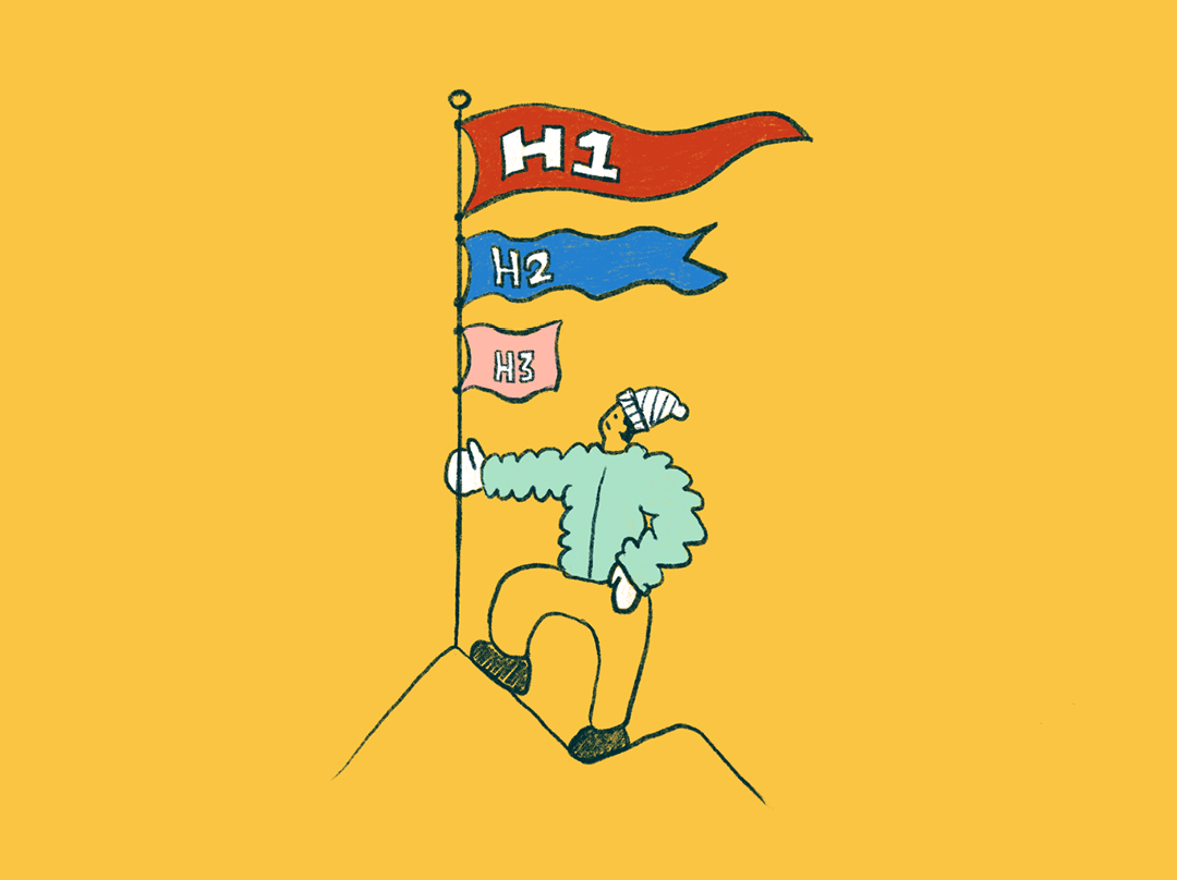
A clear visual hierarchy guides users through what’s most important on a page. Think about what you want your users to see first, second, and third and so on. What are they looking for? If they only notice one element on the page, what should it be?
A visual hierarchy is often communicated through scale. People naturally look at bigger images and headlines first. But you can also express importance by placing information higher or lower on the page or using design principles like color, contrast, and whitespace to underscore key details.
Semantic headings (H1s, H2s, H3s) help users understand where they should look first. Remember, not everything on a page can be important at once. Establishing a hierarchy makes it easier for users to find the information they need.
Rhythm & Flow

Users become fatigued seeing the same layout on every page. Keep readers engaged and avoid monotony by balancing text-heavy sections with scannable content. Color, photos, illustrations, and graphic elements are just a few ways to maintain user interest and guide their eye along a page.
However, you have to be careful, as incorporating too many elements will make your design chaotic and hard to follow. Strike a balance between consistency and variety in a way that strategically allows certain details to stand out and create a pleasing user experience.
Maintaining Accessibility Is Crucial for Associations
As you add new content to your association’s website, be vigilant about ensuring it remains accessible to users. Accessibility not only keeps your organization in compliance with the law but also boosts your site’s SEO.
Maintaining your website’s accessibility is a topic that could fill an entirely separate article. However, here are a few guidelines to keep in mind:
Image and Video Accessibility
Always add alt tags to non-decorative images and captions to videos, ensuring that users with screen readers will understand the visuals on your pages.
Proper Heading Structure
Using appropriate heading tags for headings (H1, H2, H3, etc.) enables users to understand how information is structured. Screen readers rely on these tags to interpret the page’s layout, so ensure each section is introduced with an appropriate heading.
Unique Page Titles
Every page on your website should have a unique, descriptive title. This practice not only helps with SEO but also allows users to understand the content of each page.
Correct Use of Lists
When formatting lists, use numbered or bulleted styles appropriately. This helps screen readers convey whether the items are in a specific sequence or not, making it easier for all users to navigate and understand your content.

Empower Your Team to Create Polished, Effective Pages
After you and your team launch a redesigned website, you have to protect your association’s investment. Keeping your website updated with fresh content is key, but so is ensuring every page serves your members, your association, and your brand.
The impact of one poorly designed page may seem minimal. However, over time, the cumulative effect can compromise your website’s effectiveness and diminish trust among current and potential members.
If you adhere to these best practices, you can confidently create and publish new pages that maintain design consistency while elevating your website’s impact.
Does an RFP Get Your Organization What It Really Needs? Or Just What You Ask For?
Many associations default to writing a request for proposal (RFP) when it comes to choosing a professional firm to help them rebrand their organization, redesign their website, or embark on other large projects. While it’s easy to assume RFPs are the way to get the job done fairly, effectively, and economically, this assumption tends to oversimplify a complex decision by treating it like finding the lowest price for a car.
When purchasing a car, you evaluate your needs (features and benefits) and constraints (budget), find the best option, and then find a dealer offering the best price. However, it’s not that straightforward when it comes to complex, high-value, and customized solutions. Rebranding an organization or redesigning a website requires more than searching for the firm with the lowest price. You need a firm that has solved similar problems in your industry, can correctly diagnose the source of your challenges, and possesses the experience and expertise to address them effectively.
RFPs aren’t the only way to select a firm to do your long-awaited rebranding or website project. The RFP process doesn’t typically lead to the best-qualified expert, solution, or even the best value. There’s a better way. When you use qualifications based selection (QBS), you’ll get a fairly-priced, customized solution from a true expert.

Use Qualifications Based Selection (QBS) To Get Your Association the Best Results
When you need expert solutions for complex problems, qualifications based selection (QBS) makes sense. The key difference between RFP (Request for Proposal) and QBS (Qualifications-Based Selection) lies in the criteria used for selecting a service provider:
- RFP prioritizes detailed proposals that often include a blend of qualifications, methodologies, and cost estimates, with price being a significant deciding factor.
- QBS focuses solely on selecting the most qualified provider based on their expertise, experience, and approach, negotiating scope and cost only after the best-qualified team is identified.
QBS focuses solely on selecting the most qualified provider based on their expertise, experience, and approach, negotiating scope and cost only after the best-qualified team is identified.
This distinction makes QBS more suited for complex projects where expertise is critical to success.
The QBS process ensures:
- You can select a firm based on their competency and expertise rather than price or specific deliverables.
- The expert firm drives the best value into your budget.
- Best value is measured by the quality of the solutions at a fair price.
- You’ll collaborate with the firm you choose to determine the best approach to your project and its scale and scope, the best path forward, and the appropriate deliverables to achieve the desired outcome.
QBS gives you an opportunity to collaborate, to ask tough questions—and be asked tough questions. You can have conversations with the firm that build a mutual understanding of the problem and its real cause before determining the most appropriate solutions, costs, and deliverables.

RFPs Have Their Place — But Not For Complex and Customized Solutions
RFPs do work in cut-and-dry scenarios when:
- You’ve already gone through a thoughtful process to understand and define the problem and its true root cause. You know the correct solution with clear and specific requirements, scope, and goals, allowing for detailed proposals and straightforward cost comparisons.
- Your primary concern is the lowest price. The RFP process identifies which firm offers the best-perceived value—not necessarily the most innovative, valuable solution at a fair price.
- Opportunity cost isn’t a concern. If you truly know the source of the problem and the deliverables are simple and identifiable, you’re not worried about missing a major insight or opportunity and spending resources on the wrong (or half-baked) solution.
- You’re purchasing commodity services. The work is standardized or less complex, with minimal need for specialized expertise (e.g., purchasing office supplies, printing, or basic IT services).
RFPs can limit innovation for complex creative challenges, making QBS or less formal processes more effective. A rebrand or website redesign is a critical step in advancing your association’s future — not a straightforward task. The RFP process demands precise self-diagnosis, but what if you misidentify the real problem?
Writing an effective RFP and selecting the right vendor can be equally daunting. Vendors often tailor their responses to meet your prescribed requests at the lowest possible price, which may not address deeper issues. Many top firms avoid RFPs, as the effort to research and propose innovative solutions could go to waste if they aren’t selected.
Relying on the RFP process to select a vendor can result in the wrong solution, often due to misdiagnosed problems or insufficient proposals. By the time it becomes clear that the outcome falls short of your needs, your budget may already be depleted. Avoid these risks by opting for QBS, a process that prioritizes expertise and tailored problem-solving over cost alone.

3 Easy Steps to Hiring a Vendor Via QBS
Sticking with the RFP process might feel comfortable — it’s familiar, after all. But familiarity doesn’t always lead to the best results, especially for complex projects like branding or website design.
QBS takes a fundamentally different approach: it focuses solely on selecting the most qualified provider based on their expertise, experience, and approach. Scope and cost are negotiated only after the best-qualified team is identified, ensuring the solution is tailored to your needs rather than constrained by pre-set budgets or assumptions.
The goal is to assess their qualifications — their expertise, experience, and methodology — through thoughtful dialogue rather than lengthy proposals.
Fortunately, you can adapt something familiar to ease into QBS: treat the process like hiring a new staff member. Follow these three steps:
- Define the qualifications you need in a firm. Start with a Request For Qualifications (RFQ) instead of an RFP, outlining your project’s objectives and inviting vendors to have conversations about how they approach challenges like yours. The goal is to assess their qualifications — their expertise, experience, and methodology — through thoughtful dialogue rather than lengthy proposals. Look for firms with a proven track record of working with organizations like yours and solving similar challenges effectively.
- Shortlist, interview, and rank. Narrow your options to the top three firms based on their qualifications. Review their websites, client case studies, thought leadership, and results to evaluate their expertise. Interview each firm to understand their approach, how well they grasp your project, and how effectively they communicate. Rank the candidates based on their qualifications, not cost.
Select and then collaborate to develop the best solution. Move forward with the top firm and begin collaborating. Work together to identify the root of your challenges, co-create solutions, and determine the optimal budget and deliverables to achieve your goals. By focusing first on expertise, QBS ensures the project’s scope and costs align with the best-qualified team’s approach to solving your problem.

Your Association’s Project Deserves a Better Procurement Process
Old-school RFPs simply aren’t designed to help you access top industry experts. Instead of sinking time, energy, and budget in a process that proves inefficient at best, invest in a more effective selection process. QBS springs from a firm belief that only experts should do your work and that your engagement with them should be focused and productive. It allows you to hire the best available firm to build your association’s custom ride — empowering you to take your members where they want to go.