
Designing a website for an association requires more than just visually appealing aesthetics. Accessibility and usability are critical factors that ensure your website serves all members, including those with disabilities. Among the elements that influence accessibility, color choices play a pivotal role. The right color decisions enhance the user experience and ensure your association’s website complies with the Web Content Accessibility Guidelines (WCAG), making it inclusive for all users.
The Importance of Website Accessibility for Associations
In recent years, Diversity, Equity, Inclusion, and Accessibility (DEIA) has become a priority for many associations. Accessibility is a crucial consideration for member-driven organizations, as it ensures all members can interact with your website. For associations, website accessibility isn’t just a best practice; it can protect you from lawsuits.
The Web Content Accessibility Guidelines (WCAG), developed by the World Wide Web Consortium (W3C), are the international standard for ensuring website content is accessible to all users. Most association websites aim to meet WCAG Level AA compliance, which ensures accessibility for users with visual impairments, such as color blindness and low vision. Understanding how people with visual impairments experience your website can help you identify areas for improvement. Try this color blindness simulator to see your content through their eyes.
The Importance of Planning for Accessible Colors
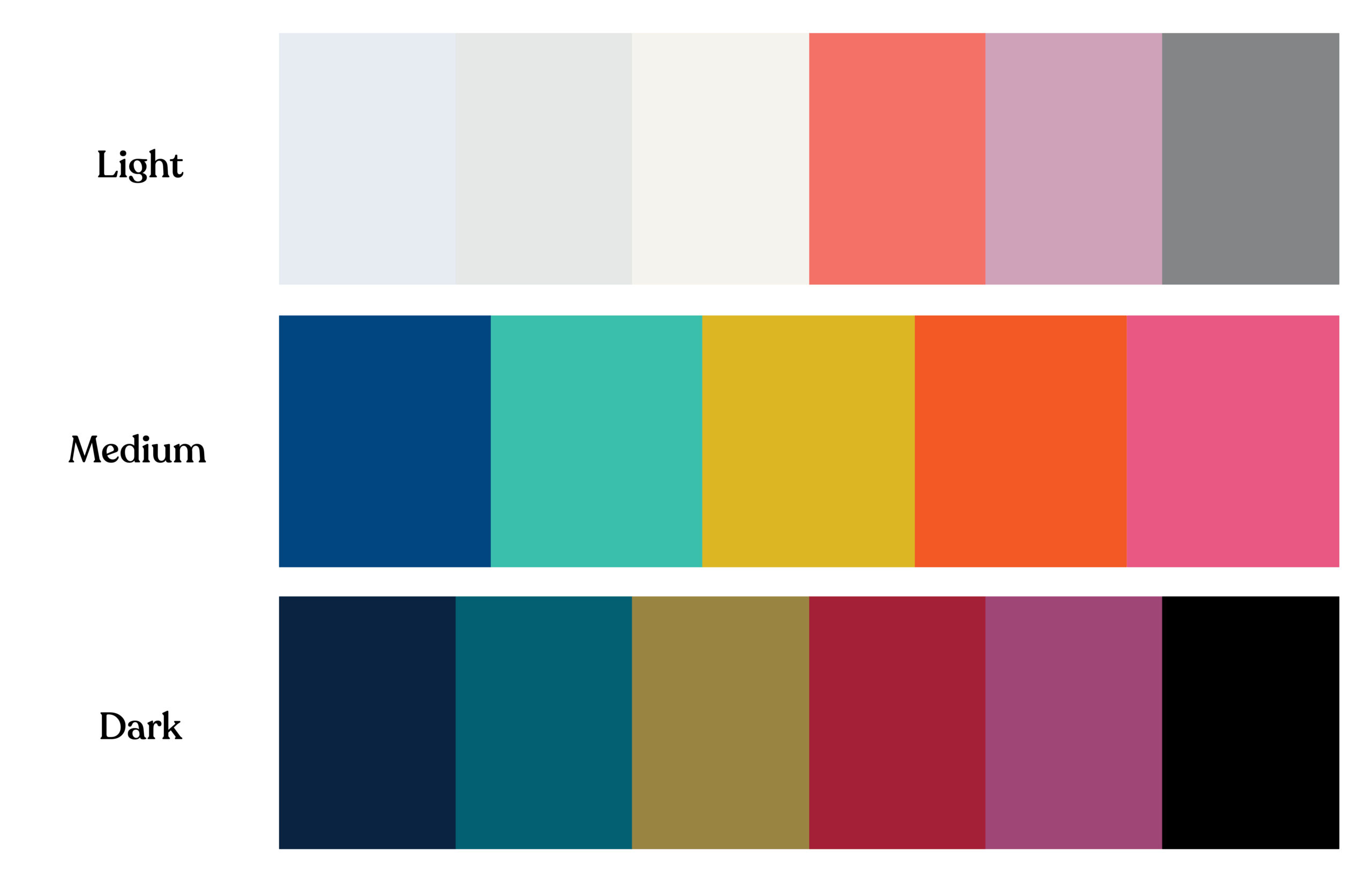
While color contrast guidelines can initially seem restrictive, thoughtful planning enables dynamic, visually compelling designs that are also accessible. When developing or updating your association’s brand color palette, it’s important to include a full range of colors: dark, medium, light, and neutrals. A robust palette ensures flexibility for a variety of applications, such as event visuals, sub-brands, and complex website layouts, without sacrificing accessibility.
Building Color Palette to Support Accessibility


Taking the extra step to test the contrast ratios of your color pairings early in the process ensures that they meet accessibility standards. This approach helps confirm that your colors can be used effectively across different design elements, like text, buttons, and call-out boxes, while maintaining compliance with ADA or WCAG guidelines. With intentional planning, you can achieve designs that are both creative and inclusive.
Understanding the Impact of Color on Accessibility
Color choices on your website significantly affect its accessibility. For example, poor color contrast can make your content difficult to read for users with visual impairments. According to WCAG Level AA standards, text should have a contrast ratio of at least 4.5:1 for normal text and 3:1 for larger text to ensure readability for all users.
Some common areas where color contrast issues often arise include:
- Text over images or videos: Text placed on top of images or video backgrounds can become unreadable if the contrast between the text and the background isn’t sufficient. It’s essential to check that the text remains legible, regardless of the background.
- Call-out boxes: Using mid-tone colors for call-out boxes can lead to poor contrast between the background and the text. Opt for either dark or light backgrounds paired with high-contrast text to ensure readability.
- Buttons and navigation elements: Vibrant colors are often used to make buttons stand out. However, if the contrast between the button’s background color and the text is too low, some users may struggle to read it. Similarly, relying solely on color to identify links can make it difficult for users with color blindness to navigate your website.
Do’s and Don’t’s


Legal Risks of Non-Compliance
Failing to comply with color accessibility guidelines can have legal repercussions. ADA-related website accessibility lawsuits are on the rise, and non-compliance with WCAG standards can expose your association to legal action. Associations are particularly vulnerable due to the public-serving nature of their websites. Ensuring your color choices adhere to WCAG guidelines mitigates legal risks and demonstrates your commitment to inclusivity.
Best Practices for Choosing Accessible Colors
To create an accessible and visually appealing website, associations should follow best practices when it comes to color. Here’s how you can ensure your color choices are both compliant and user-friendly:
1. Test Color Contrast Early and Often
Testing your color contrast during the design phase is crucial. Tools like WebAIM Contrast Checker allows designers to measure contrast ratios and ensure that all color pairings meet WCAG Level AA standards. Testing regularly throughout the design process helps avoid costly revisions later.
2. Design for Mobile Accessibility
With many users accessing association websites via mobile devices, color contrast must be tested across different screen sizes. Website elements can shift or scale on smaller screens, making color contrast appear differently than on desktops. To ensure readability and accessibility, your design team should test how colors display on all devices.
3. Avoid Using Color Alone to Convey Information
WCAG emphasizes that information should not rely solely on color. For instance, if you use color-coded charts or infographics, ensure that there are additional markers, such as patterns or labels, to distinguish between different data points. This ensures that users who cannot perceive color differences can still understand the information being presented.
For example, in a pie chart showing different membership categories, don’t rely solely on colors to differentiate segments. Instead, add patterns, distinct shapes, or labels directly on the chart to make it clear which segment corresponds to which category.
4. Consider Cognitive Disabilities in Your Color Choices
Color choices can affect not only users with visual impairments but also those with cognitive disabilities, such as ADHD or dyslexia. Bright, overwhelming colors can make it difficult for users to focus on content, while inconsistent color patterns can create confusion.
5. Continuously Test and Reevaluate Your Color Choices
Accessibility isn’t a one-time fix—it’s a continuous process. As you update and edit your website, be sure to regularly test new content for color contrast and accessibility. Implementing a regular color audit process ensures ongoing compliance and improves the user experience for all visitors.
Color Choices Empower Accessibility
Color plays a critical role in the accessibility and usability of your association’s website. By making thoughtful color choices and adhering to WCAG guidelines, you can ensure that your website is both visually appealing and inclusive for all members. Prioritizing color accessibility isn’t just about meeting legal requirements—it’s about creating an experience that serves all users, regardless of their abilities.